10 Cushion Colour Mistakes That Make A Living Room Look Busy Instead Of Layered
Cushion colours can make a living room feel layered or cluttered. Avoid these 10 common colour mistakes to create a balanced, stylish sofa that feels cohesive rather than visually busy.
10 Cushion Colour Mistakes That Can Make Your Living Room Look Cluttered
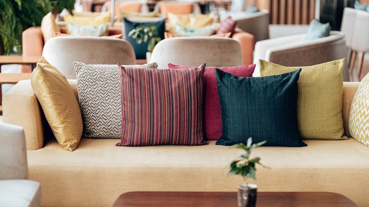
A living room can have a handsome sofa, a beautiful rug and carefully chosen lighting, yet still feel strangely unsettled. Quite often, the cushions are responsible. It sounds dramatic for something that spends most of its life being squashed during a cricket match or moved aside before someone stretches out. Yet cushions sit directly in the eye line. Their colours repeat across the largest piece of furniture in the room, so even a minor mismatch becomes surprisingly noticeable. The aim is not to make every cushion behave. A perfectly coordinated row can look just as lifeless as a pile of clashing prints. A layered room needs variation, but that variation should feel connected. Think of it like a well-planned festive thali: plenty is happening, but every element still belongs on the same table. The following colour mistakes are among the easiest ways to turn a relaxed living room into a visually noisy one.
10 Cushion Colour Mistakes That Can Make Your Living Room Look Cluttered; Photo Credit: Pexels
How To Get Cushion Colours Right Without Overcrowding The Room
1. Choosing Too Many Statement Colours At Once
A bright cushion can wake up a quiet sofa instantly. Five different statement colours can make the same sofa look as though it is hosting a paint catalogue.
The problem is rarely brightness itself. Rich teal, marigold, rust, cobalt and fuchsia can all look wonderful in a living room. Trouble begins when each colour appears once and has no visual companion elsewhere. The eye keeps jumping from cushion to cushion because nothing feels dominant or connected.
A layered arrangement usually works better when one or two accent colours take the lead. Other shades can appear in quieter versions through prints, borders or textured fabrics. For instance, a beige sofa might carry rust and olive as its stronger accents, while cream, tan and muted green soften the overall picture.
This does not mean every room needs restraint bordering on boredom. Colour lovers can still go bold. The trick is repetition. If a deep blue cushion speaks to the artwork, or a mustard cushion echoes a nearby lamp, the colour begins to feel intentional rather than random. Good layering gives the eye somewhere to rest before inviting it to look again.
Also Read: Best Cooling Pillow Covers Made From Bamboo Silk Cotton And Cooling Fibres For Summer Nights
2. Matching Every Cushion Exactly To The Sofa
Buying cushions in precisely the same shade as the sofa feels wonderfully safe. Unfortunately, safe can quickly become flat.
A grey sofa covered with five grey cushions often loses all sense of depth. Instead of looking sophisticated, the seating starts resembling one large upholstered block. The same problem appears with beige, cream, navy and brown sofas when cushions stay too close to the base colour without introducing contrast.
Layering needs small shifts in tone. A charcoal sofa can handle cushions in stone, soft grey, ivory and even muted blue. A camel sofa becomes richer with chocolate, warm cream, olive or terracotta. These neighbouring shades keep the palette connected while preventing everything from disappearing into one colour family.
Texture helps too, but colour must do some of the work. A velvet cushion in the exact same beige as a beige sofa may add softness, yet it will not create much visual separation.
Think tone-on-tone rather than exact matching. The room should look coordinated, not as though the cushions were cut from leftover sofa fabric.

10 Cushion Colour Mistakes That Can Make Your Living Room Look Cluttered; Photo Credit: Pexels
3. Mixing Warm And Cool Colours Without A Bridge
Warm and cool colours can absolutely share a living room. In fact, some of the most inviting spaces rely on that contrast. The mistake is introducing them without anything linking the two sides.
Imagine a warm tan sofa with burnt orange cushions suddenly paired with icy blue and cool silver. None of those colours is necessarily wrong. Together, however, they can feel slightly disconnected, as if two decorating plans collided midway through the afternoon.
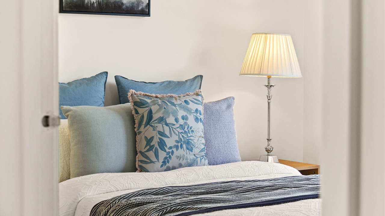
A bridging shade solves the problem. Soft cream, muted olive, dusty blue, taupe or even a patterned cushion containing both warm and cool tones can pull the arrangement together.
The undertone of the room matters as well. Warm wooden furniture, brass finishes and yellow-toned lighting naturally support earthy shades. Cool marble, chrome and blue-grey walls often favour cooler colours. Cushions do not need to copy those finishes, but they should acknowledge them.
One patterned cushion can be especially useful here. A print combining rust, cream and blue can act almost like a translator between otherwise unrelated colours.
Contrast creates interest. Connection makes that contrast feel deliberate.
4. Using The Same Colour Intensity Everywhere
A room filled entirely with strong colours can feel exhausting, even when the palette itself is beautiful.
Consider emerald green, royal blue, deep magenta and mustard. Each shade has enough personality to carry a room. Put them all together at maximum intensity, and the cushions begin competing for attention like enthusiastic relatives trying to tell the best story at dinner.
Layered colour works better when intensity changes. A deep green cushion might sit beside faded sage. Strong terracotta can be balanced with dusty peach or warm beige. Navy becomes easier on the eye when paired with denim blue, cream or a washed-out stripe.
These variations create foreground and background. Some cushions grab attention while others quietly support them.
This technique is particularly helpful in compact living rooms, where strong colour can feel visually heavier. Softer supporting shades prevent the sofa from becoming an oversized focal point.
There is no need to abandon jewel tones or saturated colours. Simply allow a few cushions to whisper.
A thoughtful colour scheme has volume control. Not every cushion needs to sing at full strength.
5. Ignoring The Colours Already Present In The Room
Cushions are often bought in isolation. A lovely cover catches the eye in a shop, looks irresistible under warm display lighting and reaches home only to discover it has absolutely nothing to talk to.
Before adding cushion colours, look around the room. Rugs, curtains, artwork, wooden furniture, lamps, planters and even book covers already contribute to the palette.
A living room with a rust-patterned rug, walnut furniture and cream curtains already offers several useful colour cues. Cushions in terracotta, tan, muted green or warm ivory would strengthen that story. Adding electric purple purely because it looked fabulous in the shop may create a separate conversation altogether.
Repeating a room colour does not mean matching it exactly. A deep green from a painting might return as olive on the sofa. A small burgundy detail in the rug could inspire a softer wine-coloured cushion.
This repetition is what makes a room feel layered over time rather than decorated in one shopping trip.
Before buying another cover for ₹899 because the colour looks irresistible, check whether the room has somewhere for that shade to belong.
6. Treating Every Pattern As A Separate Colour Palette
Patterns are brilliant for adding energy, but they can also smuggle half a rainbow onto the sofa before anyone notices.
A floral cushion might contain pink, green and yellow. A geometric cover beside it could introduce navy, orange and white. Add a traditional motif featuring red, gold and black, and suddenly the sofa is juggling nine colours.
The easiest way to avoid this is to stop judging each patterned cushion separately. Look at the entire arrangement as one palette.
Patterns should ideally share at least one or two colours. A botanical print with olive and rust, for example, can sit comfortably beside a striped cushion using rust and cream. A third cushion in solid olive then reinforces the connection.
Scale matters too, but colour is the first filter. Even dramatically different patterns can coexist when their shades relate.
This is where solid cushions earn their keep. They act as visual punctuation between busy prints and give repeating colours more presence.
Pattern mixing should feel adventurous, not accidental. When every print introduces an entirely new palette, the sofa starts looking less layered and more like the cushion aisle during a clearance sale.
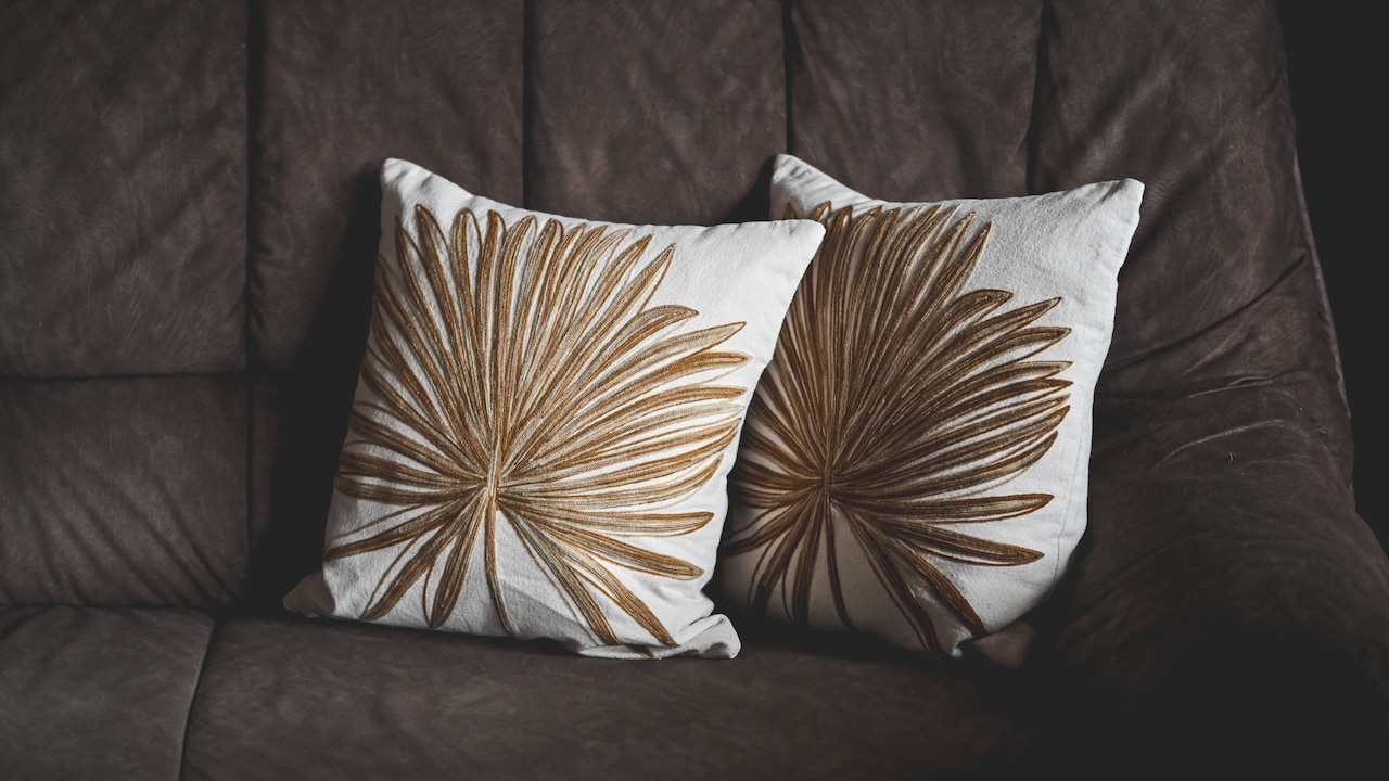
10 Cushion Colour Mistakes That Can Make Your Living Room Look Cluttered; Photo Credit: Pexels
7. Forgetting To Leave Room For Neutrals
Neutral cushions are sometimes treated as the boring relatives of colourful ones. In reality, they often hold the whole arrangement together.
Cream, oatmeal, taupe, charcoal, warm grey and natural linen tones give stronger colours breathing space. Without them, every cushion demands equal attention and the sofa can quickly become visually crowded.
Imagine a set featuring rust, mustard, forest green and burgundy. Beautiful colours, certainly, but together they may feel dense. Introduce one warm ivory cushion and suddenly each darker shade becomes easier to appreciate.
Neutrals also help when the rest of the room already contains plenty of colour. Patterned curtains, artwork, a colourful rug and decorative objects may mean the sofa does not need another explosion of pigment.
The secret is choosing neutrals that suit the room's undertone. Stark white can feel harsh beside warm woods and beige upholstery, while creamy off-white usually blends more gently. Cool grey works better in rooms with slate, blue or black accents.
Neutral does not mean invisible. It means supportive. Even the most colourful arrangements benefit from a little quiet company.
8. Picking Trend Colours That Fight The Existing Décor
Colour trends are tempting because they make old rooms feel instantly current. The problem appears when a fashionable shade enters a room with no consideration for what is already there.
A trendy burgundy cushion may look sophisticated online, but it can feel heavy against a cool aqua sofa. Butter yellow may be charming, yet struggle in a room dominated by blue-grey marble and silver finishes.
Trends work best when adapted rather than copied. Instead of chasing the exact colour appearing across social media, find a version that suits the existing palette. A cooler burgundy might work where warm wine does not. A muted ochre could make more sense than bright yellow.
Cushions are thankfully one of the easier ways to experiment because they do not require repainting walls or replacing furniture. Even so, repeated impulse buys soon add up, especially when several ₹1,200 covers are abandoned after one season.
A room feels more expensive when its palette has continuity.
Let trends visit, but do not allow them to redecorate the place without introducing themselves to the furniture first.
9. Creating Perfectly Equal Blocks Of Colour
Symmetry feels orderly, which is why many sofas end up with matching colour pairs placed at either end. Two blue cushions, two beige cushions and one yellow cushion in the centre certainly look organised. They can also feel strangely rigid.
Layered interiors usually benefit from a little imbalance.
Instead of creating exact colour blocks, allow shades to travel across the sofa. A rust cushion on one side might be echoed by a smaller rust detail in a patterned cushion on the other. Green could appear strongly once and then return subtly in a print.
This creates movement. The eye travels through the arrangement rather than reading it as a set of matching pairs.
The approach works particularly well on larger sofas and L-shaped seating, where strict repetition can start looking like hotel lobby styling. Home interiors generally feel warmer when there is a sense that pieces have been gathered rather than issued as a matching set.
Symmetry still has a place, especially in formal rooms. Yet perfect colour symmetry can remove personality.
Layering is often about controlled imperfection. The arrangement should look considered, but not so carefully measured that nobody wants to sit down.
10. Changing Cushion Colours Without Considering The Light
A cushion colour does not live in isolation. Sunlight, wall colour and artificial lighting can change it dramatically.
That elegant sage green seen under bright showroom lights may turn muddy in a darker living room. Cream can appear yellow under warm bulbs. Deep navy may look almost black in a corner that receives little daylight.
Before committing to several covers in one shade, test one in the actual room if possible. Look at it during the morning, afternoon and evening. This matters even more in rooms where daylight shifts sharply through the day.
Wall colours also reflect onto fabrics. A pale green wall can make beige upholstery feel cooler, while warm peach or cream walls can intensify reds and oranges.
Dark living rooms often benefit from cushions with lighter or clearer tones, as these create separation from the sofa. Sun-filled rooms can comfortably carry moodier shades without feeling heavy.
Colour charts and online photographs are useful starting points, not final verdicts.
The best cushion palette is the one that still looks good when the decorative lamps come on and everyday life begins.
Products Related To This Article
1. STITCHNEST Set of 5 Polycotton Cushion Covers
2. Amazon Brand - Umi Gold Leather Striped Pack of 2 Throw Pillow Covers Velvet Decorative Cushion
3. AEROHAVEN Set Of 5 Decorative Hand-Made Jute Throw
4. Stoa Paris Cushion Cover Set of 5
5. CIDIZY Modern Printed Jute Cushion Cover 16 Inch X 16 Inch
6. Home Decor Jacquard Cushion Cover Peacock-Floral Design
7. STITCHNEST Set of 2 Pastel Leaf Serenity Collection Printed Jute Cushion Covers 16x16 Inches
A layered living room does not need dozens of colours, nor does it require every cushion to match perfectly. It needs relationships between colours.
Repeating shades, varying intensity, respecting the existing décor and leaving space for neutrals can turn even an ordinary sofa into a thoughtful focal point. Pattern and bold colour can still have plenty of fun, provided they are not all fighting for the final word.
Most importantly, cushions should make a living room feel comfortable rather than overdesigned. A slightly unexpected shade, a favourite print or a cover picked up during a memorable trip can give the room character. The goal is not perfection.
When colours echo rather than compete, the whole space begins to feel calmer, richer and more naturally layered. And that is usually the difference between a sofa that looks styled and one that simply looks busy.
(Disclaimer: This article may include references to or features of products and services made available through affiliate marketing campaigns. NDTV Convergence Limited (“NDTV”) strives to maintain editorial independence while participating in such campaigns. NDTV does not assume responsibility for the performance or claims of any featured products or services.)