How to Choose The Right Dupatta Shade For Bright Kurtas: Easy Styling Tips To Balance Bold Colours
A bright kurta can be a statement piece, but pairing it with the wrong dupatta can turn your glow into glare. From festive reds to neon greens, this guide spills the secrets to toning down bold hues without dulling your charm.

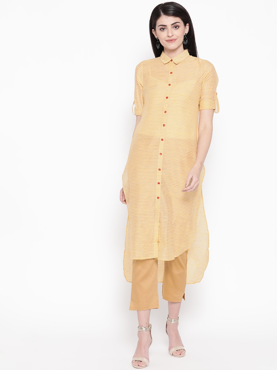
The Right Dupatta Shade For Bright Kurtas: Know How To Tone Colour Down.
There's something magical about a bright kurta. Whether it's a sunshine yellow on a breezy morning or a fiery red that lights up a festive evening, colour has the power to lift moods and make memories. But too much brightness can sometimes steal attention for the wrong reasons. The secret to styling vibrant kurtas lies in pairing them with the right dupatta shade, one that balances, not battles, your outfit.
Fashion, after all, is not just about clothes; it's about conversation, between colours, fabrics, and emotions. And the dupatta, often underestimated, is that quiet peacemaker that ties the story together. The right shade doesn't just tone down loud colours; it enhances your poise, giving every look a touch of finesse.
Here's how to master the art of choosing dupatta shades that let your kurta shine, without blinding the crowd.

If you want to know how to choose the right dupatta colours for bright kurtas, here are tips to tone it down.
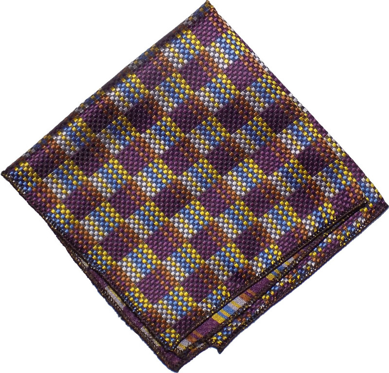
Photo Credit: Pexels
Finding The Perfect Balance: Smart Ways To Pair Dupattas With Bright Kurtas
1. Start With The Colour Wheel: Understanding Contrast and Harmony
Before rushing to your wardrobe, take a moment to think like an artist. The colour wheel isn't just for painters; it's the backbone of smart dressing. When working with bright kurtas, the trick is to use contrasting or complementary shades thoughtfully.
For instance, a bright pink kurta pairs beautifully with a muted beige, off-white, or soft grey dupatta. These neutral tones absorb excess brightness, letting the kurta stay in the spotlight without overwhelming your look. Similarly, a neon green kurta finds its calm companion in a pastel lavender or dusty rose.
Remember, contrast adds interest, but balance adds beauty. When colours fight for attention, you lose the plot. The key is to make one hero and one sidekick. Let the kurta lead, and the dupatta support, like good background music in a perfect scene.
2. Neutrals Never Fail: The Power of Beige, Ivory, and White
Neutrals are the dependable friends of every wardrobe. Whether it's a lime green kurta or a cobalt blue one, a dupatta in beige, ivory, or plain white can instantly tone things down. These shades act like soft filters, muting brightness while adding sophistication.
Imagine walking into a brunch wearing a fuchsia kurta with a sheer ivory dupatta delicately draped across the shoulder. The brightness becomes softer, your face glows more naturally, and the overall vibe feels effortless. That's the power of neutrals, they let your personality, not just your clothes, do the talking.
For everyday wear, cotton or linen dupattas in neutral shades are practical too. They blend with nearly any outfit, making them perfect for mix-and-match styling. A ₹500 neutral dupatta can transform multiple kurtas, giving you endless combinations without endless spending.
3. Earthy Shades For Subtle Elegance
When bold hues meet earthy tones, the result is instant calm. Rust, olive, taupe, and mustard dupattas can tone down everything from bright magenta to turquoise. Earthy shades have a grounding quality, they connect brightness to something more natural, more wearable.
Picture a sunflower-yellow kurta paired with a rust dupatta. The contrast is lively yet mature, cheerful yet controlled. This mix brings festive flair without shouting for attention. Earthy tones also work beautifully with cottons, khadis, and handlooms, adding a rustic, homely charm to the outfit.
A secret tip: when unsure, reach for a dupatta with brown or tan undertones. These shades flatter most skin tones and lend a touch of understated grace to any ensemble.
Also Read: How To Pick Dupattas That Do Not Slip Off During Weddings and Festive Celebrations: 10 Style Tips
4. Pastels To The Rescue: Soothing Softness For Bold Colours
Pastels have an unspoken gentleness that mellows bold shades beautifully. Pair a bright orange kurta with a mint green dupatta, or wear an electric blue kurta with a blush pink one, the result is dreamy and balanced.
Soft hues like peach, powder blue, and lilac act as visual breathers. They calm the intensity of your kurta while keeping your look vibrant and fresh. Perfect for daytime functions, pastel dupattas photograph well too, they reflect light softly, giving your skin a natural glow.
If you love experimenting, try organza or chiffon dupattas in pastel tones. Their lightness adds an airy charm, perfect for summer weddings or Sunday lunches. The magic lies in contrast, the calm next to the bold, like a melody balancing a beat.
5. Prints And Patterns: The Art Of Distraction
When your kurta screams colour, a printed dupatta can whisper balance. Floral, geometric, or traditional prints help diffuse brightness without dulling the outfit. A multicoloured block-printed dupatta with neutral undertones can tone down a solid bright kurta while adding visual depth.
For example, a bright red kurta with a white dupatta featuring subtle gold motifs creates a harmonious yet festive look. Printed dupattas also help you reuse the same kurta in multiple ways, pair it with florals one day, stripes the next, and suddenly, you've got three fresh looks without buying more clothes.
Pro tip: stick to smaller or softer prints for very bright kurtas. Loud prints on loud colours can clash. The goal is not to compete but to complement.
6. Monochrome Magic: When Similar Shades Work Wonders
Sometimes, less contrast brings more charm. Wearing a dupatta in the same colour family as your kurta creates a seamless, graceful effect. The trick is to choose a shade slightly lighter or darker than your kurta.
For instance, a deep maroon kurta with a wine dupatta exudes richness, while a lemon-yellow kurta with a butter-yellow dupatta feels serene. Monochrome looks elongate the body, making you appear taller and more put-together.
This style works beautifully for formal events, especially when paired with statement jewellery or embroidered footwear. It's elegant without being loud, a confident silence that speaks volumes.
7. Metallic Tones: A Touch Of Glam Without Overdoing It
Metallic dupattas, think gold, bronze, or silver, can tone down bright kurtas while adding subtle glamour. They reflect light in just the right amount, lending richness without turning gaudy.
Pair a royal blue kurta with a dull gold dupatta for a wedding-ready look or a coral kurta with a silver shimmer for an evening gathering. The idea is to choose muted metallics rather than shiny ones. Matte finishes create elegance, while glossy ones can overpower.
And here's a style secret: metallic dupattas transition easily from day to night. Throw one over a bright kurta for office festivities, and you're instantly ready for an after-hours celebration without changing your outfit.
8. Ombre and Dual-Toned Dupattas: Blending Brightness Gracefully
Ombre dupattas, those that fade beautifully from one shade to another, are lifesavers for bright kurtas. They create a smooth visual gradient that softens strong colours naturally.
For instance, an ombre dupatta shifting from beige to coral can perfectly balance a bright orange kurta. Similarly, a dual-toned piece with dusty pink and cream can harmonise a hot pink outfit. The transition of shades gives the look depth, movement, and a designer-like touch without spending a fortune.
These dupattas are also travel-friendly; they complement multiple kurtas, helping you pack light and look fabulous. They bring the best of both worlds, colour and calm, in a single, graceful drape.
9. Fabric Matters: Sheerness And Texture Change Everything
Sometimes, it's not the colour but the fabric that determines how loud or subtle an outfit feels. A bright red kurta with a heavy silk dupatta may look overpowering, but switch to a chiffon or organza version, and suddenly the same red feels softer.
Sheer fabrics tone down brightness by allowing light to pass through, creating a delicate visual balance. Cotton dupattas add earthiness, while silks add richness. If the kurta is heavily embellished, go for a simple, matte-textured dupatta. If the kurta is plain, feel free to add a bit of shimmer.
Think of fabrics as emotional tones, some whisper, some sing, some celebrate. Knowing when to let each one speak makes you a true stylist.
10. Trust Your Reflection: Dressing Beyond Rules
Fashion tips are great guides, but the mirror is your best critic. Colours react differently to skin tones, lighting, and mood. What looks overpowering under fluorescent lights might glow beautifully in sunlight.
When you drape a dupatta, notice how it makes you feel. Does it calm the outfit, or does it steal attention? Does your face glow more, or less? These small observations help you build your signature style, one that's personal, expressive, and comfortable.
At the end of the day, confidence is the best complement. Whether you're wearing a neon kurta with a cream dupatta or a pastel one with a printed wrap, own it with a smile. That's the real art of toning it down, balancing colour with comfort, and fashion with feeling.

The Right Dupatta Shade For Bright Kurtas: Know How To Tone Colour Down
Photo Credit: Pexels
Products Related To This Article
1. Sangria Ethnic Motifs Banarasi Dupatta
2. SWI Stylish Ethnic Motifs Printed Chiffon Dupatta with Mirror Work
3. WEAVERS VILLA White Embroidered Dupatta
4. Sangria Dupatta
5. Dupatta Bazaar Silver-Toned Woven Design Banarasi Silk Dupatta
6. HK colours of fashion Geometric Woven Design Shawl
7. Globus Ethnic Motifs Printed Kalamkari Silk Dupatta
Choosing the right dupatta for a bright kurta isn't about rules, it's about rhythm. It's the dance between vibrance and grace, between tradition and modernity. Every shade, every texture, tells a story; it's just about finding the one that lets your personality shine.
So next time you're standing before your wardrobe, kurta in hand and indecision in your eyes, remember this: you don't have to dim your brightness to look elegant. You only need the right shade to let it bloom beautifully. Whether it's a humble cotton dupatta worth ₹700 or a silk one stitched for a festive affair, the magic lies in the match.
Because style isn't about what's loudest, it's about what lasts. And the right dupatta shade? It's that quiet note that makes the whole melody unforgettable.
Disclaimer: The images used in this article are for illustration purpose only. They may not be an exact representation of the products, categories and brands listed in this article.