10 Reasons Decorative Clocks Look Too Small Once They Are On The Wall
A decorative clock can look perfect in a shop but strangely small on your wall. Discover 10 common reasons behind this mismatch and practical ways to choose the right size.
10 Reasons Your Decorative Wall Clock Looks Too Small And How To Fix It
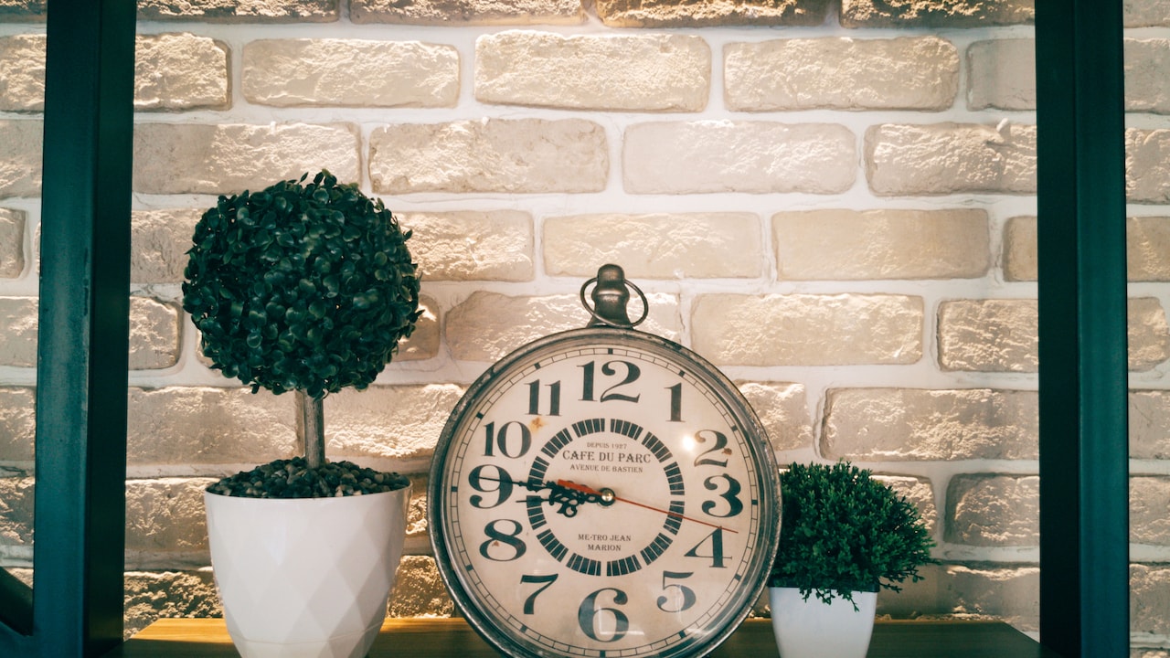
A beautiful decorative clock can completely change how a room feels. Whether it's a sleek metallic design, a vintage wooden piece or a colourful statement clock, the right choice adds personality without demanding much effort. Yet, there's one frustrating experience that many homeowners know too well. A clock that looked wonderfully proportioned in a showroom suddenly appears tiny after installation. The design still looks attractive, the colour works beautifully, and the quality seems fine. So, why does it look so underwhelming? The problem often has little to do with the clock itself. Wall proportions, furniture placement, viewing distance and even surrounding decorations influence how large or small an object appears. A 30 cm clock might look substantial on a display shelf but almost disappear against a spacious living room wall. Understanding these visual tricks can prevent disappointing purchases and unnecessary changes to your décor. More importantly, it helps you choose clocks that complement your room rather than getting lost in it. Here are ten surprisingly common reasons decorative clocks look smaller after installation and what you can do to avoid the problem.
10 Reasons Your Decorative Wall Clock Looks Too Small And How To Fix It
Photo Credit: Pexels
Why Decorative Clocks Appear Smaller On Walls
1. The Wall Is Much Larger Than You Realised
An empty wall can play tricks on your sense of proportion. When shopping for a decorative clock, attention usually goes towards its colour, material and design. The actual dimensions of the wall rarely enter the picture. Unfortunately, that forgotten measurement can make all the difference.
Consider a living room with a wall stretching nearly 12 feet across. A decorative clock measuring 25 or 30 cm might look impressive while sitting on a shop counter. Once mounted on that large surface, however, it becomes a tiny detail rather than a noticeable decorative feature.
This happens because our eyes judge objects in relation to their surroundings. A clock doesn't suddenly shrink after installation. The enormous wall simply makes its dimensions less impressive.
Before purchasing, measure the available wall space and decide how much visual attention the clock should command. If it needs to serve as a focal point, consider a larger design or one with a broader decorative frame.
You can also use newspaper sheets to create a temporary outline of the clock on your wall. Step backwards and observe the proportions from different positions. It's a simple exercise that can save you from discovering an expensive decorating mistake after drilling the wall.
2. Showroom Displays Create A Misleading Sense Of Scale
Home décor showrooms know how to make decorative objects look appealing. Carefully arranged shelves, focused lighting and coordinated accessories help customers imagine how products might look at home. However, these attractive displays don't always communicate the true scale of an item.
A decorative clock might sit against a narrow display panel surrounded by smaller ornaments. In that setting, it naturally becomes the centre of attention. Bring the same clock into a spacious living room, and the visual impact changes dramatically.
Online product photographs can create a similar illusion. Some images show clocks against cropped wall sections without giving viewers a reliable reference for their actual dimensions. A design that appears substantial on a phone screen might measure only 20 cm across.
That's why dimensions deserve more attention than photographs. Check the full diameter, frame width and overall decorative spread before making a decision.
When shopping offline, hold the clock against a larger background rather than judging it on a crowded shelf. For online purchases, compare the listed measurements with objects you already own.
A measuring tape might not sound particularly exciting, but it's certainly more useful than falling in love with a clock that looks like a decorative button on your wall.
3. High Ceilings Make Decorative Clocks Appear Smaller
Ceiling height influences how we perceive almost every decorative object in a room. A clock that feels perfectly balanced in a compact bedroom may look surprisingly modest in a living room with tall ceilings.
The reason comes down to vertical proportions. Higher ceilings create additional wall space above furniture, doors and windows. This extra height makes smaller decorative objects appear less prominent, especially when the surrounding area remains empty.
For example, a 30 cm clock might look perfectly suitable in a room with an eight-foot ceiling. Move it into a space with a ten-foot ceiling, and the same piece may struggle to make an impression.
However, choosing the largest available clock isn't always the answer. The better approach involves considering the relationship between ceiling height, furniture and the intended viewing position.
Large decorative clocks with broader frames often work well in taller rooms. Designs featuring extended Roman numerals, metal spokes or artistic borders can also create a stronger visual presence without appearing excessively bulky.
Another option involves placing the clock within a coordinated wall arrangement. Framed photographs, narrow shelves or complementary artwork can visually connect the clock to the surrounding space.
The goal isn't to fill every empty corner. It's to make the clock feel intentional rather than stranded halfway up an enormous wall.
Also Read: Wall Clocks Under ₹599 That Look Stylish And Modern
4. The Clock Has A Thin Frame And Minimal Design
Minimalist clocks bring elegance to modern interiors. Their clean lines, delicate hands and understated frames can look effortlessly sophisticated. However, these same characteristics sometimes make them appear smaller than expected.
A clock's visual size depends on more than its outer diameter. Frame thickness, colour contrast and decorative details all influence how much space the object seems to occupy.
Imagine two clocks measuring 35 cm across. One features a bold wooden frame and prominent numerals. The other has a slender metallic border, fine hands and almost invisible hour markers. Although both share identical dimensions, the first will usually appear more substantial.
This difference becomes particularly noticeable on large walls or when people view the clock from across the room.
Minimal designs aren't unsuitable for spacious interiors. They simply need thoughtful placement. A thin-framed clock may work beautifully above a compact console table or within a carefully arranged gallery wall.
For a stronger standalone appearance, consider designs with wider borders, contrasting colours or more noticeable hour markers.
Also, pay attention to the clock's overall visual weight. A lightweight design can complement a restrained interior, while a bold decorative piece may suit a room filled with heavier furniture.
The trick lies in matching the clock's visual presence to the room rather than relying entirely on its measurements.
5. The Clock Is Hanging Too High On The Wall
Sometimes, the clock isn't too small at all. It's simply hanging in the wrong place.
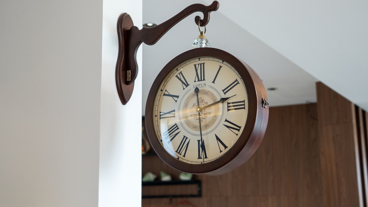
A common decorating mistake involves placing wall clocks unusually high, particularly above sofas, television units or dining furniture. Homeowners may assume that higher placement improves visibility. Instead, it can disconnect the clock from the rest of the room.
When a clock sits far above nearby furniture, the empty space beneath it makes the object appear isolated. Our eyes struggle to connect it with other decorative elements, which can exaggerate its apparent smallness.
A better approach involves considering how people naturally view the wall. For an open wall, positioning the clock's centre around average standing eye level often creates a comfortable visual balance.
Above furniture, the clock should feel connected to the piece beneath it without appearing cramped. The ideal distance depends on the furniture's height, the clock's diameter and the overall arrangement.
Try holding a cardboard template against the wall before fixing anything permanently. Move it slightly higher or lower while observing the composition from the doorway and seating areas.
Small adjustments can create surprisingly noticeable improvements.
After all, a decorative clock should feel like part of the room, not something that accidentally climbed towards the ceiling.
10 Reasons Your Decorative Wall Clock Looks Too Small And How To Fix It
Photo Credit: Pexels
6. Nearby Furniture Makes The Clock Look Disproportionate
Furniture plays an enormous role in determining whether a decorative clock looks suitably sized. A clock that appears attractive on its own might seem unusually small when positioned above a wide sofa, oversized cabinet or long dining table.
This happens because furniture provides an immediate visual reference. When a large object dominates the lower portion of a wall, smaller decorations above it can appear comparatively insignificant.
Picture a three-seater sofa stretching across most of your living room wall. A small circular clock placed directly above its centre may leave the arrangement looking incomplete. There's simply too much furniture competing with too little decoration.
One solution involves selecting a larger clock that establishes a stronger relationship with the furniture beneath it.
Alternatively, create a grouped display with framed artwork or complementary wall accessories. This arrangement allows the decorative composition to occupy more space without requiring an enormous clock.
It's also worth considering the furniture's shape. Broad horizontal units often benefit from decorations that establish enough width or visual balance above them.
However, avoid choosing clock dimensions according to rigid formulas alone. A bold clock with strong detailing may hold its own better than a slightly larger minimalist version.
Ultimately, the wall, furniture and clock should feel like they're having the same conversation rather than competing for attention.
7. Wall Colours Reduce The Clock's Visual Impact
Colour has a remarkable ability to change how large decorative objects appear. Two clocks with identical measurements can look completely different depending on the colour of the wall behind them.
When a clock closely matches the wall colour, its edges become less noticeable. This creates a soft, blended appearance that works beautifully in some interiors. However, it can also make the clock seem smaller.
For instance, a beige wooden clock mounted against a cream-coloured wall may lack enough contrast to stand out. Similarly, a slim black clock on a charcoal accent wall might almost disappear under certain lighting conditions.
Contrast helps define an object's boundaries. When those boundaries become clearer, the decorative piece often appears more prominent.
This doesn't mean every clock needs a dramatically different colour. Subtle differences in finish, texture or frame material can create enough distinction.
A brass clock against a deep green wall, for example, can establish a noticeable decorative presence. Likewise, a dark wooden frame may stand out beautifully against a pale neutral background.
Consider how natural and artificial lighting affect these combinations throughout the day.
Before purchasing, compare the clock's colour with your wall rather than judging it against a plain product photograph.
Sometimes, the missing ingredient isn't another ten centimetres of diameter. It's simply better contrast.
8. Other Wall Decorations Compete For Attention
Decorative clocks often share wall space with paintings, photographs, mirrors and shelves. While these combinations can create interesting interiors, they also introduce visual competition.
A clock that looks substantial on an empty wall might seem much smaller when surrounded by larger artwork or numerous decorative accessories.
Imagine a gallery wall featuring several colourful paintings, family photographs and a modest circular clock. Unless the arrangement establishes a clear visual hierarchy, the clock may become just another small object competing for attention.
This doesn't necessarily mean removing your favourite decorations. Instead, reconsider how the pieces relate to one another.
If the clock serves as the main feature, give it sufficient breathing space. Avoid placing large, heavily detailed artwork immediately beside it.
For gallery walls, arrange smaller frames around the clock while maintaining consistent gaps. This can help the clock feel like the central element rather than an afterthought.
You can also create balance through colour. Repeating the clock's frame finish in nearby artwork or accessories helps connect the display visually.
Remember that decorative arrangements need occasional empty spaces. Filling every available gap doesn't automatically create a more attractive room.
Sometimes, removing one unnecessary frame makes the clock appear more substantial than purchasing an entirely new one.
9. Viewing Distance Changes How Large The Clock Appears
A decorative clock rarely receives attention from just one position. People might notice it while entering the room, relaxing on the sofa, sitting at the dining table or walking through a hallway.
Each viewing distance changes how large the clock appears.
A 25 cm clock might feel perfectly suitable when viewed from two feet away. However, the same design can look surprisingly small from the opposite end of a spacious living room.
This becomes particularly noticeable in open-plan homes, where dining and seating areas share one continuous space. A clock mounted near the dining table may need enough visual presence to remain noticeable from the sofa several metres away.
The solution involves evaluating the clock from the positions where people will actually see it.
Before purchasing, place a paper template on the intended wall and observe it from the room's main seating and entry points. If the outline looks insignificant from those positions, consider a larger design.
Also, think about readability. Small numerals, thin hands and low-contrast faces become harder to distinguish as the distance increases.
A decorative clock can certainly prioritise appearance over practical timekeeping. Still, there's something mildly amusing about owning a beautiful clock that requires walking across the room to read.
Choosing a proportionate design helps avoid both problems.
10. The Clock's Advertised Size Doesn't Match Its Visual Presence
Clock measurements can sometimes create expectations that the actual design doesn't fulfil. A product listing might advertise a decorative clock with a diameter of 60 cm, leading shoppers to imagine a large, prominent wall feature.
However, that measurement may include extended spokes, decorative branches or widely spaced hour markers. The central clock face itself might measure only 20 cm.
Once installed, the design can appear noticeably smaller because much of its advertised diameter consists of open space.
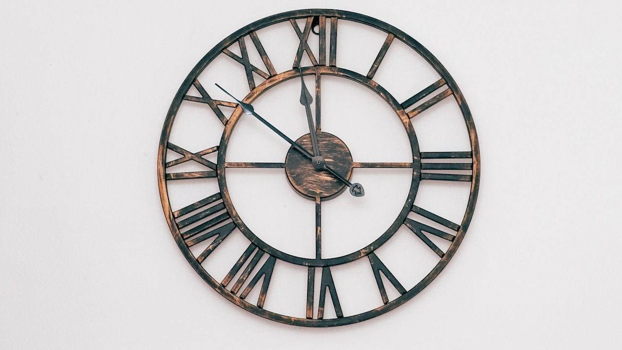
This issue commonly affects oversized metal clocks, sunburst designs and models featuring separate decorative numerals.
The overall dimensions may be accurate, but they don't necessarily communicate how substantial the clock will look.
Before buying, examine the relationship between the central dial and the outer decorative elements. A wide design with delicate extensions may feel visually lighter than a smaller clock with a solid frame.
For DIY wall clocks featuring individual number stickers, installation spacing also influences the final appearance. Arranging the numerals too closely can make the completed design look smaller than expected.
Product photographs showing the clock against furniture can offer useful clues, but always confirm the measurements.
Where possible, check customer photographs to understand the proportions in everyday rooms.
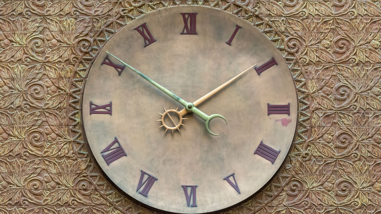
Ultimately, a clock's visual presence depends on how much space its design actually occupies, not merely the largest number printed in its specifications.
10 Reasons Your Decorative Wall Clock Looks Too Small And How To Fix It
Photo Credit: Pexels
Products Related To This Article
1. RANDOM Metallic Foil Finish With Sweep Silent Classic 12.75 Inch Wall Clock
2. Myntra Elegant Homes Navy Blue & Gold-Toned Embellished Wall Clock
3. nest ART Nest Art Wall Clock White Plastic & Glass Sweep Silent Movement Analog Wall Clock
4. RANDOM Embossed Foiling Wall Ticking Clock- 8inch
5. Kuber Industries Pink & Blue Printed Round Shaped Wall Clock
6. MARKET99 White Round Minimalist Plastic Wall Clock
7. OLIVE TREE Big Size Vinyle MDF Large Display Round Battery Analogue Wall Clock
A decorative clock that looks too small on the wall isn't necessarily a poor purchase. More often, the surrounding space, furniture, lighting and placement create an unexpected visual mismatch. Understanding these influences makes choosing the right clock much easier.
Before buying, measure your wall, consider nearby furniture and evaluate the design from different viewing distances. Pay attention to frame thickness, colour contrast and the difference between advertised dimensions and actual visual presence.
Most importantly, remember that bigger doesn't automatically mean better. A thoughtfully positioned clock with the right proportions can make a stronger impression than an oversized design that overwhelms the room.
(Disclaimer: This article may include references to or features of products and services made available through affiliate marketing campaigns. NDTV Convergence Limited (“NDTV”) strives to maintain editorial independence while participating in such campaigns. NDTV does not assume responsibility for the performance or claims of any featured products or services.)