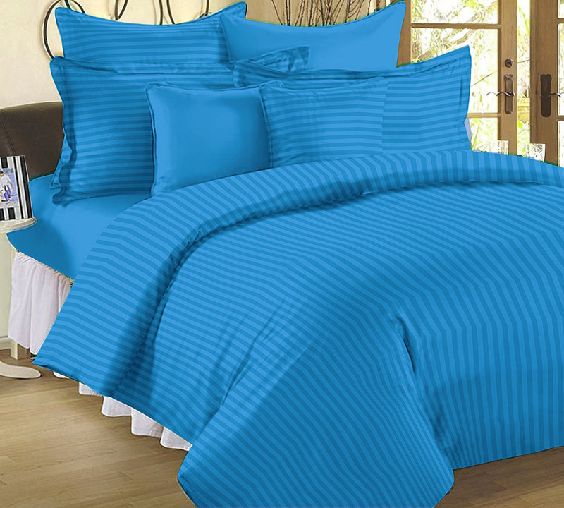
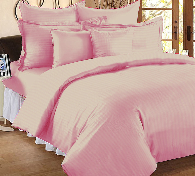
How To Choose Carpet Colours That Make Rooms Look Bigger
A clever carpet can change the way a room feels. With the right colours, even compact spaces can appear brighter, wider and more welcoming. Here is all about how to choose carpet colours that instantly expand your space.

10 easy tips to make your room look bigger with the right carpet colour.
Homes in bustling towns and growing cities often come with compact rooms that call for smart design. A good carpet colour can change how a space looks and behaves, especially when every inch matters. Colour doesn't just sit beneath the feet, it creates mood, influences light and affects depth. Some shades stretch walls outward, some tighten them in, and some create a calming balance that pulls a room together. Choosing the right carpet colour takes more than picking a favourite shade. It calls for thought, practicality and an understanding of how colours interact with light, décor and daily life. With simple techniques and a bit of creative thinking, any home can feel airier, fresher and more spacious without shifting a wall or spending more than needed.

Read how you can choose carpet colours to make your room look bigger; Photo Credit: Unsplash
Below are ten practical and engaging colour strategies that help rooms look bigger while keeping comfort, lifestyle and personal style in mind.
Also Read: 5 Best Carpets For Bedrooms In 2025: Affordable, Stylish And Soft Picks To Buy Now
Design Tips To Make Rooms Look Bigger Through Colour
1. Choose Lighter Shades To Open Up The Space
Light colours create the illusion of openness because they bounce light around the room. They lift shadows, brighten corners and spread a gentle glow. Shades like soft beige, warm ivory, cream and pale sand work well in homes that need a soothing and airy feel. These colours blend nicely with most décor styles too, from modern flats to traditional family homes.
A light-coloured carpet also keeps a room looking tidy because dust marks stay subtle. A living room, for example, feels twice as wide when sunlight catches a cream carpet and reflects it across the walls. Even in a room with small windows, a lighter carpet adds a fresh energy that feels welcoming.
Those who prefer warmth can shift to light honey or wheat tones. These shades add cosiness without shrinking the room. Lighter carpets form a calm base, allowing furniture to shine without crowding the environment.
2. Embrace Warm Neutrals for a Balanced Look
Warm neutrals bring harmony to small or narrow rooms. Colours like mocha, biscuit, oatmeal and warm taupe add just enough depth without overwhelming the senses. They create a grounded feeling while still allowing the space to breathe. Homes with varied lighting, some bright areas and some dim pockets, benefit from these tones because they work well across different conditions.
Warm neutrals also pair beautifully with wooden furniture, brass accents and earthy décor elements that often feature in many households. A taupe carpet beneath a wooden centre table, for example, brings a cohesive look that feels both modern and timeless.
Another advantage lies in maintenance. Warm tones hide daily wear better than stark white carpets, making them practical for busy families. When used in bedrooms, warm neutrals create a peaceful base that feels relaxed after a long day, all while helping the room feel more open.
3. Try Cool Undertones to Create Visual Depth
Cool undertones, such as soft grey, misty blue or pale sage, help stretch a room visually because they feel breezy and light. These colours mimic natural elements like early-morning skies or gentle eucalyptus leaves, which naturally soothe the eyes. A cool-toned carpet encourages a restful vibe that makes a room feel larger and calmer.
Grey remains a popular choice for compact spaces because it works with nearly every colour palette. It supports everything from bold wall art to colourful cushions. Pale grey carpets help light bounce across the room without feeling stark or clinical.
If the room faces strong sunlight during the day, cool tones balance the warmth and prevent the space from feeling heated. This balance creates a visual freshness, making the carpet look expansive. Cool undertones also suit minimal interiors that aim for clean lines and uncluttered layouts.

Try cool undertones to add some depth to your room; Photo Credit: Pexels
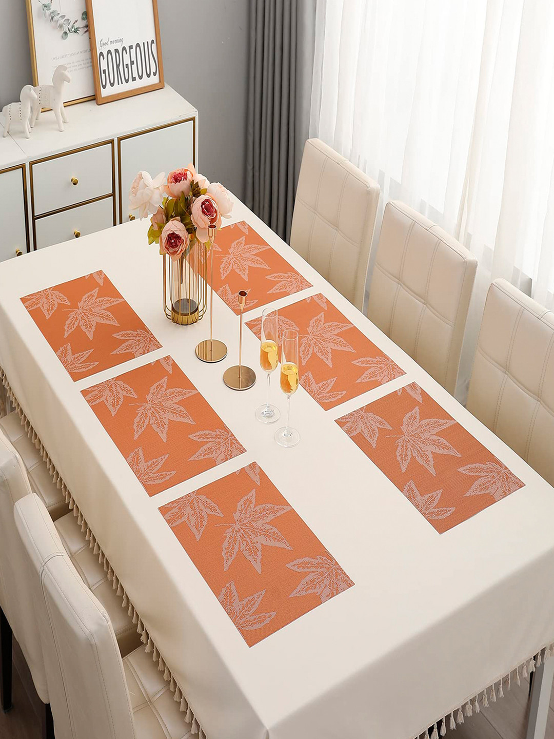
4. Use Striped Carpets to Lengthen the Room
Stripes create direction, and direction influences perception. A carpet with long, subtle stripes can elongate a room instantly. When the stripes run parallel to the length of the room, they guide the eyes forward, creating the feeling of extra space.
Neutral stripes in soft beige, muted grey or warm cream keep things elegant and avoid visual clutter. Even thin stripes work wonders in compact hallways or narrow bedrooms. A striped carpet also adds character without overwhelming the décor.
This trick works especially well in homes where corridors feel tight. A striped runner carpet stretching down the hallway creates a sense of movement and flow. Stripes also work in living rooms where the furniture placement follows the same direction as the pattern. The result is a seamless, elongated look that feels open and structured.
5. Match Carpet Colours with the Walls for a Seamless Feel
When carpet and wall colours stay within the same shade family, the room appears more fluid. The eye doesn't stop at the floor or jump abruptly between colours. Instead, everything blends softly, and the space feels bigger. For example, a pale beige wall with a matching sandy carpet creates a smooth, uninterrupted surface.
This technique works beautifully in compact living rooms or studio layouts. When all surfaces share a unified palette, the space avoids harsh breaks that shrink the room. Even slight variations, like pairing a light cream wall with a slightly deeper cream carpet, offer the same effect.
Seamless colour schemes also create a relaxing atmosphere. Homes where peace and simplicity matter benefit from this approach. Matching tones help the décor stand out without fighting with the flooring.
6. Use Carpets with Subtle Patterns for Gentle Expansion
Bold patterns can feel overwhelming in small rooms, but soft, delicate patterns create the opposite effect. A carpet with faint geometric shapes or lightly textured designs adds depth without drawing too much attention. These patterns trick the eyes into seeing more movement and space.
For example, a carpet with a lightly raised weave in pale grey or soft beige adds texture that lifts the room. A gentle diamond or lattice design works well, too. These understated patterns add personality while keeping the room light and spacious.
Subtle patterns also hide minor stains, an advantage for homes with children or pets. They offer a blend of practicality and beauty, maintaining liveliness in the room without crowding it. When paired with simple furniture, patterned carpets create a balanced, visually appealing layout.

Opt for carpets with subtle prints rather than bold designs; Photo Credit: Pexels
7. Go for Carpets That Reflect Natural Light
Some carpets naturally reflect more light than others. Materials with a slight sheen, like certain blends of nylon or polyester, help bounce light around the room. When sunlight or artificial light hits such carpets, the surface brightens the space and widens it visually.
A soft cream or faint pearl-grey carpet with a light-reflective finish boosts the brightness of any room. Homes located on lower floors or those with limited windows benefit the most from this approach. The carpet helps make up for missing natural light.
While reflective carpets look elegant, they still feel warm and inviting. Their soft shimmer creates a luxurious touch without going over the top. When used under warm lighting, they create a cosy radiance that makes evenings feel comfortable and calming.
8. Choose Earthy Pastels for a Fresh, Spacious Feel
Earthy pastels combine the charm of nature with the softness of muted tones. Shades like muted peach, pale olive, dusty rose and light terracotta create a warm yet open feel. They bring character without closing in the room.
These colours work beautifully in homes filled with greenery or natural materials like cane, jute and wood. A pale olive carpet under a jute lampshade, for example, gives a soothing, airy aesthetic. Earthy pastels also pair well with colourful accents, making décor experiments easier.
Pastel carpets keep the atmosphere bright while carrying subtle warmth. They suit bedrooms, casual lounges and reading corners where comfort and openness matter. They offer a gentle splash of colour without overpowering the environment.
9. Use Monochrome Themes to Avoid Cluttered Looks
A monochrome palette means using different tones of the same colour throughout the room. This approach avoids visual clutter because the space follows a single colour story. A room with a dove-grey carpet, slate-grey cushions and a soft-grey rug, for example, feels cohesive and spacious.
Monochrome décor supports both minimalist and traditional styles. It brings calmness to busy households because the eye travels smoothly across the room. In compact homes, monochrome themes remove the chaos that comes with contrasting colours, making the area appear wider.
This technique also allows small décor items, like metallic lamps, textured throws or warm-toned pottery, to shine. With the carpet acting as a subtle anchor, everything else falls into place softly and naturally.

Go for monochromatic themes to make your room look bigger; Photo Credit: Pexels
10. Consider Practical Shades That Age Gracefully
Rooms look bigger, not just when colours work well but also when carpets stay clean and vibrant over time. Practical shades like warm greys, muted beiges and soft browns age beautifully. They hide minor wear, keep stains discreet and maintain a fresh look for years.
Busy homes with frequent visitors or active children need shades that balance elegance with longevity. A practical carpet ensures the room always looks tidy and open. When a carpet stays in good condition, it continues to brighten the room without distracting marks.
Practical colours also blend with multiple décor themes, making redecorating easier. Whether the furniture changes from modern to traditional, the carpet remains a dependable base that keeps the room spacious and inviting.
Products Related To This Article
1. Floral Design Acrylic Polyester Carpet for Living Room
2. Rug for Living Room 5x7 feet Shaggy Carpet Plain Soft Fur Rectangular Rugs
3. ishro home 3 x 5 Feet 3D Jet Multi Printed Carpet Rug Runner and Carpets
4. JVK Heavy Fabric Velvet Touch Bedroom
5. Carpet for Living Room 4x6 Feet Modern Soft Shaggy Carpet Thick
6. Handmade Upcycled Sustainable Printed Rug
7. Handwoven 3D Carved Super Soft Shaggy Collection
Colour plays a powerful role in shaping how large or small a room feels. With the right carpet shades, textures and finishes, even compact spaces can transform into bright, airy and balanced environments. Choosing a suitable carpet colour isn't about trends alone. It's about shaping comfort, mood and practicality. With thoughtful choices and a dash of creativity, any home can feel bigger, brighter and more welcoming, all without breaking the budget or moving a single wall.
(Disclaimer: This article may include references to or features of products and services made available through affiliate marketing campaigns. NDTV Convergence Limited (“NDTV”) strives to maintain editorial independence while participating in such campaigns. NDTV does not assume responsibility for the performance or claims of any featured products or services.)