Wall Clock Placement Rules: Where To Hang A Clock For The Best Look
Your wall clock isn’t ugly, it’s just badly placed. These simple placement rules will stop it from looking awkward, distracting, or “floating,” and make it feel like it truly belongs in your space.

Why Your Wall Clock Looks Odd And Distracting: Placement Rules To Get It Right.
A wall clock is one of those everyday objects people stop noticing, until it starts bothering them. Maybe it sits too high, like it's avoiding eye contact. Maybe it looks tiny on a big wall, like it got lost. Or maybe it sits right above the TV, ticking away like a tiny judge during every dramatic scene.
Clocks have a strange power in a home. They aren't just décor. They create rhythm. They set a mood. They can make a space feel calm and organised or slightly unsettled, like something is always off by two degrees.
And the funny part? It's rarely the clock's fault. It's almost always the placement.
So, if the clock in the living room feels distracting, the bedroom clock looks oddly aggressive, or the kitchen clock makes the wall feel cramped, these placement rules will fix it, without needing a new clock, a new wall, or a dramatic home makeover.
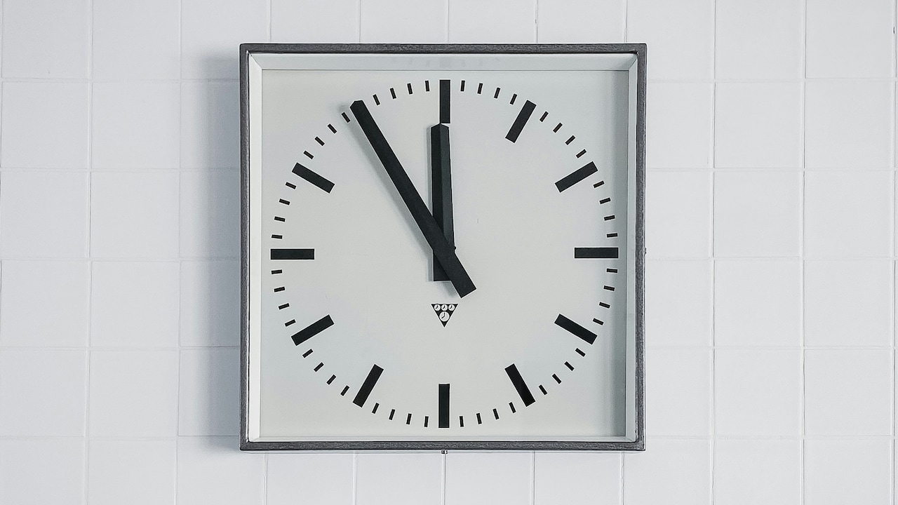
Why Your Wall Clock Looks Odd And Distracting: Placement Rules To Get It Right
Photo Credit: Pexels
The 10 Placement Rules That Make Any Wall Clock Look Right
1. Stop Hanging It Too High (The “School Corridor” Problem)
One of the most common reasons a wall clock looks odd is simple: it's too high. Many homes hang clocks at a height that feels more suitable for a railway station or a school corridor. The thinking usually goes, “Higher means everyone can see it.” In reality, higher often means everyone keeps tilting their neck like they're watching a ceiling fan.
A clock should sit close to eye level in the space where people actually spend time. In a living room, that usually means the centre of the clock sits roughly at the same height as the centre of a wall painting. If the clock ends up hovering near the ceiling, it will look disconnected from the rest of the room. It got placed there during a rushed cleaning session before guests arrived.
A simple trick helps: stand where people usually sit and look at the wall naturally. If the clock makes the eyes travel upward too much, it's too high. Comfort matters. A clock should feel like a friendly neighbour, not a distant relative.
2. Respect the “Visual Centre” Of the Wall, Not the Physical Centre
Many people place a clock in the exact centre of the wall, like it's a maths problem. But walls aren't blank pages. They have furniture, doors, windows, switches, and sometimes that one stubborn cable trunking that nobody talks about.
A clock looks right when it sits in the visual centre of the wall, not the geometric centre. The visual centre depends on what sits below it. A sofa, a console table, and a bookshelf, these objects create balance. If the clock floats in the middle of a wall with nothing underneath, it can feel like it's waiting for the rest of the décor to show up.
Think of it like a family photo. The clock should belong to the “group” on that wall. It should look connected, not isolated. This is why a clock above a sideboard often looks more intentional than a clock randomly centred between two windows.
The goal isn't symmetry for the sake of it. The goal is harmony. The wall should feel like it's telling a complete story, not leaving the clock as a lonely plot twist.
3. Avoid the “Too Small, Too Lost” Look on Large Walls
A small clock on a large wall can feel like a whisper in a stadium. The wall dominates, the clock disappears, and the whole arrangement looks accidental. This is especially common in newer flats with taller ceilings and wide living room walls.
Scale matters. A clock needs to match the wall's size and the furniture around it. If a wall stretches wide behind a sofa, a tiny clock will look like it was hung temporarily and forgotten. Even if the clock itself is beautiful, the mismatch makes it feel off.
This doesn't mean every home needs a giant clock that looks like it belongs in a café. It means the clock should hold its own. If the wall is large, the clock should be larger, or it should be part of a grouping with other elements like frames or shelves. Otherwise, the eye keeps searching for something that isn't there.
A good clock should feel confident on the wall. Not shy. Not apologetic. Confident.
4. Don't Let It Compete With the TV (Because It Will Win)
Placing a wall clock above or near the TV is one of the easiest ways to make a room feel distracting. Even if the clock looks stylish, the movement of the hands and the constant presence of time pull attention away from the screen.
It's not just about aesthetics. It's about psychology. A clock near the TV makes people feel time passing more intensely. Suddenly, a relaxed evening becomes a silent countdown. The mind keeps glancing at the clock during scenes, and before anyone realises it, the mood shifts from “movie night” to “How late is it already?”
A clock belongs in a place where time helps, not where it nags. In a living room, a clock works better on a side wall, near a reading chair, or above a console. Somewhere visible but not dominant.
And if someone insists the TV wall “needs something,” a clock is rarely the best choice. That wall already has a star. The clock shouldn't audition for the same role.
5. Match the Clock Style to the Room's Mood, Not Just the Wall Colour
A clock can look odd even when placed correctly, simply because its style clashes with the room's mood. This happens more often than people admit. A sleek metallic clock in a cosy, traditional space can feel cold. A vintage Roman numeral clock in a minimal modern room can feel theatrical.
A room has a personality. The clock should fit that personality. A calm bedroom benefits from a softer, simpler clock face. A lively kitchen can handle a bolder design. A formal dining space often looks better with a classic piece.
The mismatch creates subtle visual tension. People may not know why the clock feels distracting, but they'll feel it. It's like wearing sports shoes with a sherwani. Technically, it works. But the brain will notice something is off.
Also, consider finish and texture. A wooden clock in a room with wooden furniture feels natural. A glossy clock in a matte room can look too shiny. The goal is not to match everything perfectly, but to make the clock feel like it belongs.
6. Keep It Away From Clutter Zones (Especially Kitchens and Entryways)
Some walls are naturally chaotic. Kitchens often have cabinets, jars, appliances, hooks, and shelves competing for attention. Entryways have keys, bags, shoes, and that one chair that becomes a dumping ground. Hanging a clock in these zones can make it feel lost or visually messy.
A clock needs breathing space. If it sits too close to busy shelves, switchboards, or hanging organisers, it becomes part of the clutter. Then it looks distracting because the eye can't settle on it.
In kitchens, the best placement usually sits above a clear patch of wall, often above the dining nook or on a wall opposite the stove. In entryways, a clock works best above a slim console or on a clean wall where it becomes a welcoming anchor.
The key is to avoid visual noise. A clock should bring order, not join the chaos. When it sits in a clutter zone, it starts feeling like another item to manage. And a clock should never feel like a chore.
7. Fix the Glare Problem Before It Ruins the Clock Entirely
A clock that catches glare looks odd even when it's perfectly placed. The glass reflects tube lights, windows, or ceiling fixtures, and suddenly the clock face becomes unreadable at certain angles. People keep squinting, shifting, and losing patience.
This is common in living rooms with large windows or strong overhead lighting. It's also common in homes where the clock sits opposite a balcony door. The glare makes the clock feel like it's hiding the time, which is a strange thing for a clock to do.
Before finalising placement, check the clock from different spots: sofa, dining chair, kitchen counter, and even the hallway. If glare blocks the face, move it slightly. Sometimes shifting it by even a few inches changes everything.
If the clock has a glossy frame, it can also reflect light and look too “loud.” Matte finishes tend to behave better. A clock should be easy on the eyes. If it constantly flashes reflections, it will feel irritating, like a notification you can't mute.
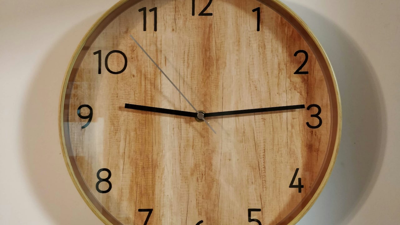
Why Your Wall Clock Looks Odd And Distracting: Placement Rules To Get It Right
Photo Credit: Unsplash
8. Don't Place It Where It Creates “Time Anxiety”
Some placements make people feel tense. A clock right in front of the bed can create a strange sense of pressure. A clock placed where it's the first thing seen in the morning can feel like a boss clocking you in. A clock directly above a study desk can feel like a silent supervisor.
This isn't dramatic. It's real. People often complain about feeling restless in a room without realising that the clock placement is contributing. A clock has emotional weight. It represents schedules, deadlines, school runs, meetings, and all those “Where did the day go?” moments.
In bedrooms, a clock should not dominate the wall facing the bed. It's better on a side wall or near a dressing area. In workspaces, a clock should be visible but not looming. It should support focus, not add pressure.
A home should have spaces where time feels gentle. Not every room needs to constantly remind everyone of it. Sometimes, the best clock placement is simply… less intense.
9. Use It as a Design Anchor, Not a Random Afterthought
A clock looks distracting when it feels randomly placed, like it was hung to fill an empty spot. The solution is to treat it as a design anchor. That means it should connect with other elements on the wall and help structure the space visually.
For example, a clock above a console table looks more grounded if there's a small lamp, a plant, or a framed photo below it. In a dining area, a clock looks intentional when it aligns with the centre of the table. In a hallway, a clock can anchor a gallery wall, acting as the “hero” piece.
The trick is not to overdo it. A clock should not become a theme park attraction. But it should feel planned. Even simple spaces look elevated when the clock placement feels deliberate.
People notice this instantly, even if they can't explain it. A well-placed clock makes a home feel organised. A badly placed clock makes it feel slightly chaotic. It's amazing how much power one circle on the wall can have.
10. Align It With Real Life Movement, Not Just Aesthetics
The most overlooked rule: place the clock where people naturally look. Not where it looks best in a photo. Not where it seems symmetrical. Where it works in real life.
Think about daily movement. In the morning, people walk from the bedroom to the kitchen to the main door. In the evening, most time is spent in the living room or dining space. During the day, the kitchen and work corner matter. A clock should support these routines.
A clock in a corridor may look elegant, but if nobody ever checks it there, it becomes decorative only. Meanwhile, a clock placed near the dining area can be genuinely useful during breakfast rush, especially when someone is trying to pack lunch and also remember if the school bus comes at 7:45 or 7:50.
Practical placement often ends up looking better, too, because it feels natural. A home is not a showroom. It's a living space. When the clock aligns with how people move and live, it stops looking odd. It starts looking right.
Products Related To This Article
1. Ajanta Red Glass Large Display Square Battery Analogue Wall Clock
2. RANDOM Black Plastic Ultra Clear Glass Round Battery Analogue Wall Clock
3. TEAL BY CHUMBAK Red & White Floral Printed Contemporary Table Clock
4. Aura Black Printed Traditional Wall Clock
5. OLIVE TREE Cream-Coloured Printed Contemporary Wall Clock
A wall clock should feel like a calm presence, not an awkward distraction. When it looks odd, it usually isn't because the clock is ugly. It's because it's fighting the wall, the light, the furniture, or the mood of the room.
Fixing it doesn't require expensive décor or a new purchase. It requires attention to height, scale, glare, and how the space actually gets used. A clock placed with intention makes a room feel balanced. It makes the home feel quietly organised.
And once it's in the right spot, something strange happens: people stop noticing it. Not because it disappears, but because it finally belongs. That's the magic of good placement. The clock does its job, the room feels calmer, and nobody feels like time is yelling from the wall.
(Disclaimer: This article may include references to or features of products and services made available through affiliate marketing campaigns. NDTV Convergence Limited (“NDTV”) strives to maintain editorial independence while participating in such campaigns. NDTV does not assume responsibility for the performance or claims of any featured products or services.)




![Steam Iron Teflon Shoe Cover for ES-300,ST-96 [Only For ES-300 and ST-96 Model Electric Steam Irons]](https://m.media-amazon.com/images/I/51wwkttondL._SL160_.jpg)


