How To Choose Ethnicwear Prints That Flatter Your Shape Without Making You Look Broader
Choose ethnicwear prints that flatter, not widen. Learn the easiest print tricks, scale, spacing, contrast, and placement, to look balanced, sharper, and instantly more streamlined.

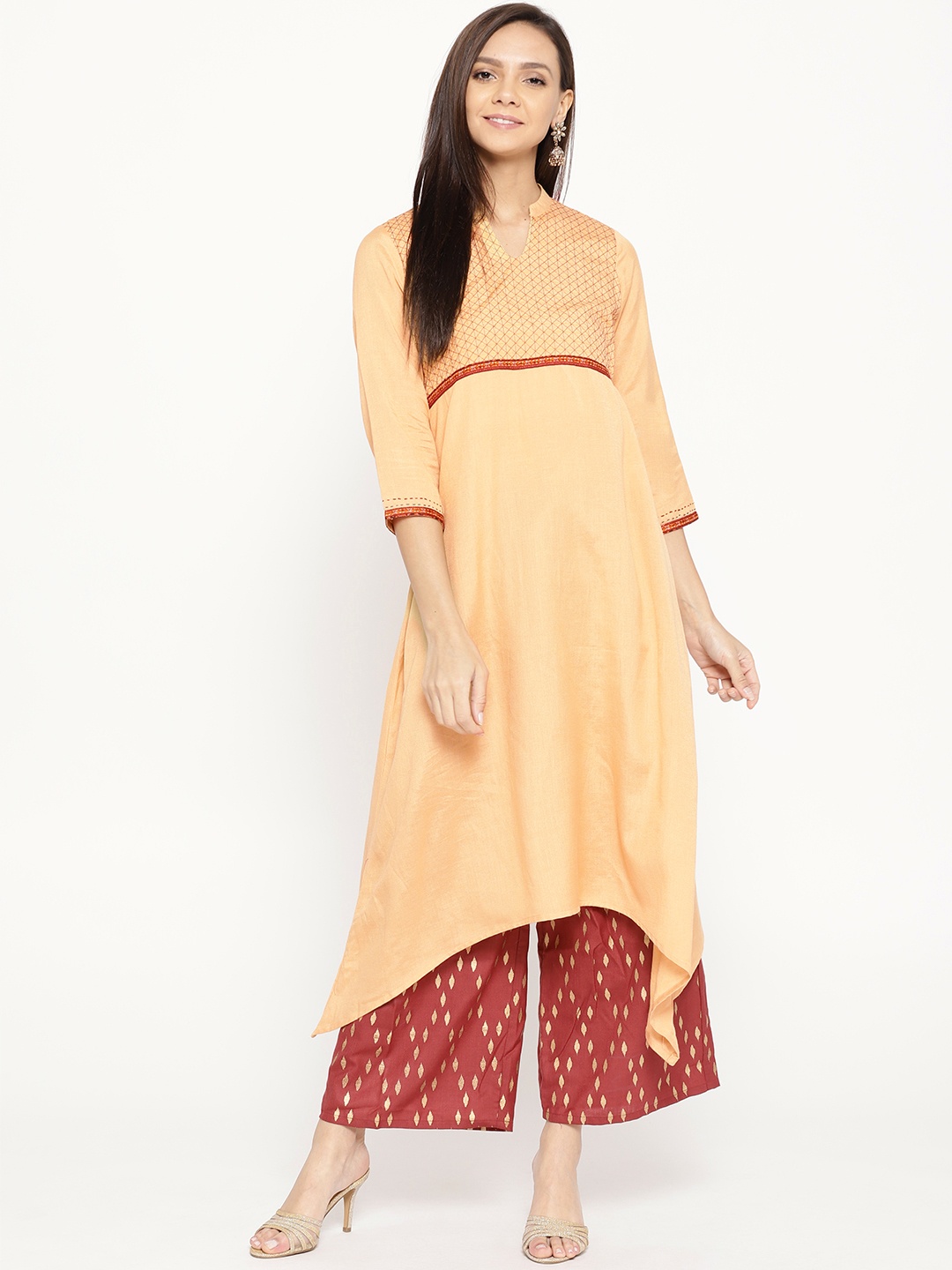
Important things to consider in ethnicwear prints that don't make you look wider.
There's a special kind of heartbreak that comes from trying on a gorgeous kurta, looking in the mirror, and thinking, “Why do I look broader?” Not bigger. Not heavier. Just wider, like your silhouette got stretched sideways by a mischievous tailor.
The thing is, prints are not innocent. They don't just sit there quietly. Prints create optical illusions. They pull attention. They add movement. They either streamline your look or make it feel busy, bulky, and oddly boxy.

Things to look for in ethnicwear prints that don't make you look wider; Photo Credit: Pexels
And no, this isn't about “hiding” your body. It's about dressing with intention. Because when a print works, it doesn't just flatter you. It also makes you feel lighter, sharper, and more confident, like you've got your life together, even if your laundry pile says otherwise.
So if you love ethnicwear but want to avoid prints that make you look wider, here are ten smart, wearable ways to choose better. No stiff fashion rules. No boring jargon. Just print logic that makes sense.
Also Read: Are Floral Prints Too Loud? Here Is How To Wear Them Without Feeling Overdressed
The Golden Rules Of Ethnicwear Prints
1. Choose Prints With Vertical Movement
When a print creates an up-and-down rhythm, the eye naturally travels vertically. That instantly makes the body look longer and more streamlined. This is why prints like vertical butis, vine motifs, elongated paisleys, and stripe-inspired designs often feel flattering, even on days when the body feels bloated or the weather feels unforgiving.
The main focus here is on movement. If the print feels like it's flowing down the fabric rather than sitting across it, you're already winning. A kurta with vertically placed motifs, for example, can make the torso look leaner without any dramatic tailoring tricks.
A simple test helps: stand a little away from the mirror and squint. If your eye goes from shoulder to hem naturally, the print supports length. If your eye keeps stopping across the chest or hips, it's creating width.
This also explains why certain long kurtas look instantly elegant. They don't just have length. They have vertical energy.
2. Avoid Prints That Stretch Sideways
Some prints are practically designed to make the body look broader. Horizontal stripes are the obvious culprits, but they're not alone. Wide borders, chunky bands, and prints that sit in rows across the fabric can all create a “widening” effect.
Even if the outfit fits perfectly, a sideways pattern can make the silhouette look heavier. This is especially noticeable in kurtas with bold chest-level bands or in sarees where the border is thick and high-contrast.
This doesn't mean horizontal elements are banned forever. It just means they need to be used carefully. A thin stripe can look chic. A subtle pattern can look modern. But a wide, loud, across-the-body print? That's the fashion equivalent of eating extra spicy pani puri and then pretending your stomach is fine.
If you love stripes, look for diagonals, broken stripes, or ones that are softened by texture. They feel less harsh and far more forgiving.
3. Pick Medium-Scale Prints Over Tiny Or Giant Ones
Print scale matters more than most people realise. Very tiny prints can sometimes make the fabric look busy and cluttered, especially in synthetic materials. On the other hand, oversized prints can make the body look like it's carrying the print rather than wearing it.
Medium-scale prints tend to be the sweet spot. They look balanced, they photograph well, and they usually don't distort as much when the fabric moves.
A medium floral, for example, often flatters because it creates structure without overwhelming the body. The same goes for block prints with moderate spacing. They give the eye something to enjoy without making the outfit feel crowded.
Think of it like jewellery. Tiny pieces can disappear. Huge pieces can dominate. But something proportionate looks intentional and stylish.
If you're shopping online, zoom in. If the print looks like it's fighting for space, skip it. If it looks calm and evenly placed, you've found a winner.
4. Watch The Spacing Between Motifs
Spacing is the quiet hero of flattering prints. Two outfits can have the same motif, same colour, and same fabric, yet one looks slimming while the other adds width. The difference often lies in how the motifs are spaced.
When motifs are packed tightly together, the outfit can look visually heavier. It creates density, and density reads as volume. Wider spacing, on the other hand, gives the eye room to breathe. It creates lightness.
This matters a lot in ethnicwear because many traditional prints use repeated motifs. If those repeats are too close, the fabric can start looking like wallpaper. Lovely wallpaper, sure. But still wallpaper.
A spaced-out buti print on a straight kurta often looks sharper than a crowded one. And if the motifs get denser around the hips or chest, it can exaggerate width in those areas.
So yes, spacing is basically the difference between elegant and “why does this look like a curtain?”
5. Use Dark Grounds With Soft Contrasts
A darker base colour naturally recedes. That means it visually moves back, making the body look more streamlined. But here's the important part: contrast can ruin the effect.
A black kurta with bright white, high-contrast motifs can still look wide because the motifs pop aggressively. The eye clings to them, and suddenly the print becomes the main event.
Soft contrast is far more flattering. Think navy with muted gold, bottle green with soft beige, maroon with dusty pink, charcoal with gentle grey. These combinations feel rich without being loud.
This works beautifully for festive dressing too. You still look dressed up, but you don't look visually “expanded” by harsh colour jumps.
If you want a brighter look, keep the base deeper and let the print be warmer rather than stark. That way, you get glow, not bulk.
Also, soft contrast looks more expensive. Even when the kurta costs ₹899.

Opt for ethnicwear in dark colours with soft contrasts; Photo Credit: Pexels
6. Keep Borders Slim And Strategic
Borders in ethnicwear are like eyeliner. Done right, they sharpen your look. Done wrong, they drag everything down.
A thick border at the hem can visually widen the lower half, especially if it's heavy and high-contrast. A thick border on the dupatta can add bulk around the shoulders and chest. And a wide border across the sleeves can make arms look broader.
Slim borders are safer and more flattering. They define without dominating. Even better if they are placed vertically, like along the placket, or in side panels. Those placements create length and structure.
If you love a strong border, keep it away from the widest part of your body. For example, a bold hem border can work better on an A-line kurta than on a straight one. A heavy dupatta border can look better when draped loosely rather than wrapped tightly.
Borders should frame you, not fence you in.
7. Choose Prints That Flow With The Fabric
Not all prints behave the same on different fabrics. A print that looks elegant on cotton may look chaotic on chiffon. A bold motif that looks regal on silk may look bulky on crepe.
Fabric movement changes how the print sits on the body. Stiffer fabrics hold shape, so prints look crisp. Softer fabrics cling and drape, so prints distort more. That distortion can create unwanted width, especially around the hips, bust, and tummy.
This is why certain prints look stunning on the hanger but strange on the body. The fabric shifts, the motif bends, and suddenly the design looks stretched.
If you prefer flowy fabrics, choose prints with less rigid geometry. Florals, watercolour styles, and scattered butis often look softer. If you like structured fabrics, you can handle stronger block prints and sharper patterns.
The best print is one that moves with you, not one that argues with gravity.
8. Say Yes To Diagonals And Asymmetry
Diagonal prints are brilliant for flattering the body because they disrupt width. They keep the eye moving, and they create a sense of dynamic shape rather than straight-across bulk.
Asymmetrical prints do something similar. They stop the outfit from looking like a flat rectangle. When the print placement is slightly off-centre, the eye doesn't fixate on one broad area. It travels.
This is why diagonal ikat-inspired patterns, chevrons, and slanted motifs can feel so slimming. Even an angled yoke design can make the torso look more sculpted.
Asymmetry also adds style. It feels modern without losing cultural charm. A kurta with an asymmetrical printed panel, for example, can look very runway-ready while still being perfectly wearable for brunch, office, or a small family function.
And the best part? It makes you look like you made an effort, even when you didn't.
9. Use Print Placement To Control Attention
Print placement can either flatter you or betray you. A print that is heavy around the hips will pull attention there. A bold motif right across the bust can make the upper body look wider. A busy pattern everywhere can make the whole silhouette feel bulky.
Strategic placement solves this. Look for kurtas where the print is concentrated vertically in the centre. Or where side panels are darker, and the middle is printed. That creates a slimming illusion without needing shapewear or complicated styling.
Another smart option is a printed dupatta with a plain kurta. It gives you personality without wrapping your entire body in visual noise.
Also, prints near the face can be your best friend. A pretty neckline motif or an elegant yoke draws attention upwards, making the body look longer.
The idea is simple: guide the eye. Don't let the print run wild like a toddler in a sweet shop.
10. Balance Prints With The Right Silhouette
Even the best print can look wider if the silhouette fights it. A straight kurta with a large, busy print may look boxy. A flared kurta with dense motifs can look bulky. A heavily printed anarkali can look overwhelming if the print scale doesn't match the flare.
Silhouette and print must work as a team. If the cut is simple, the print can have more personality. If the cut is dramatic, the print should calm down.
For example, an A-line kurta looks great with medium prints and spaced motifs. A straight kurta looks sleek with vertical prints and subtle contrasts. A long anarkali looks best with smaller, more delicate motifs that don't compete with the volume.
Also, consider your styling. A chunky necklace plus a loud print plus a bold dupatta can feel like a festival on your torso. Sometimes less is more.
The goal is harmony, not chaos.
Products Related To This Article
1. Avirah Women Printed Straight Kurta
2. House Pataudi Men Printed Straight Kurta
3. Ethnicbasket Women Printed Straight Kurta
4. Jompers Men Printed Straight Kurta
5. Koshin Men Printed Straight Kurta
Prints don't make anyone look “good” or “bad.” But they do create illusions. And once you understand those illusions, shopping becomes easier, dressing becomes smarter, and the mirror stops giving surprise plot twists.
The best ethnicwear prints don't scream for attention. They guide the eye gently. They create length, balance, and flow. They make you feel put-together even on days when you're running late, your hair has its own agenda, and you're surviving on chai and hope.
So next time you're choosing a kurta, saree, or suit set, don't just ask if the print is pretty. Ask if it moves vertically, if the spacing feels breathable, if the contrast is soft, and if the border behaves itself.
Because the right print doesn't just flatter your body. It also flatters your mood. And honestly, that's the kind of fashion magic worth keeping.
(Disclaimer: This article may include references to or features of products and services made available through affiliate marketing campaigns. NDTV Convergence Limited (“NDTV”) strives to maintain editorial independence while participating in such campaigns. NDTV does not assume responsibility for the performance or claims of any featured products or services.)