Buying Watches That Don’t Match Your Skin Tone: Here’s How to Fix It
Most watches fail not because of price or brand, but because they clash with skin tone. Here’s how to choose the right colours, metals, and styles that actually suit you.

Buying A Watch? Here's How To Match It Perfectly With Your Skin Tone
Walk into any mall or scroll through an online store, and the choices feel endless. Stainless steel, rose gold, leather straps, bold dials, minimalist faces, the options tempt even the most practical buyer. Yet, despite spending anywhere from ₹2,000 to ₹50,000 or more, something often feels off after the purchase. The watch may be beautiful, but it doesn't quite “sit right” on the wrist.
That subtle mismatch often has nothing to do with the brand or price. It comes down to skin tone, a detail many ignore but stylists quietly prioritise. A well-matched watch can elevate even a simple outfit, while a mismatched one can dull the overall look, no matter how polished the rest appears.
This isn't about strict fashion rules or expensive upgrades. It's about understanding what works naturally. With a few thoughtful adjustments, choosing the right watch becomes less confusing and far more satisfying.

Buying A Watch? Here's How To Match It Perfectly With Your Skin Tone; Photo Credit: Pexels
How To Choose Watches That Actually Suit Your Skin Tone
Understanding Skin Tone Before Buying Watches
Most people confuse skin tone with complexion. Fair, medium, or deep doesn't tell the full story. What truly matters is the undertone, warm, cool, or neutral. A simple way to check involves looking at veins under natural light. Greenish veins often suggest warm undertones, bluish ones hint at cool tones, and a mix indicates neutrality.
This detail matters more than expected. A watch that clashes with undertones can appear too harsh or oddly dull. For instance, someone may try on a shiny silver watch that looks stunning in the display but feels lifeless on the wrist. The reason lies in undertone mismatch, not personal taste.
Understanding this basic distinction simplifies the entire buying process. It reduces impulsive purchases and increases the chances of finding something that feels naturally flattering. Think of it as choosing the right lighting for a room; it changes everything without altering the space itself.
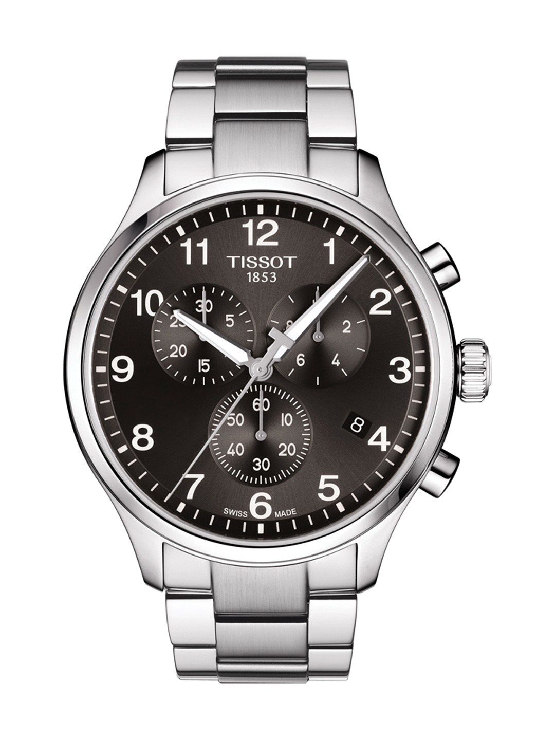
Why Metal Colour Plays A Bigger Role Than You Think
The metal finish of a watch often determines how it blends with skin. Gold, silver, rose gold, and gunmetal each carry a different visual temperature. Warm undertones usually harmonise better with gold and rose gold, while cool undertones pair well with silver and platinum shades.
Consider a festive occasion where someone wears a gold-toned watch with traditional attire. If the undertone aligns, the entire look appears richer. If not, the watch stands out awkwardly, almost like it belongs to someone else.
Metal colour also affects versatility. A poorly chosen shade limits how often the watch gets worn. It ends up sitting in a drawer despite its price. On the other hand, the right tone becomes a daily companion, effortlessly matching both casual and formal outfits.
Choosing wisely here saves both money and regret. It turns a purchase into a long-term style asset rather than a short-lived experiment.
Also Read: Luxury On A Budget: Top 10 Branded Watches You Must Check Out
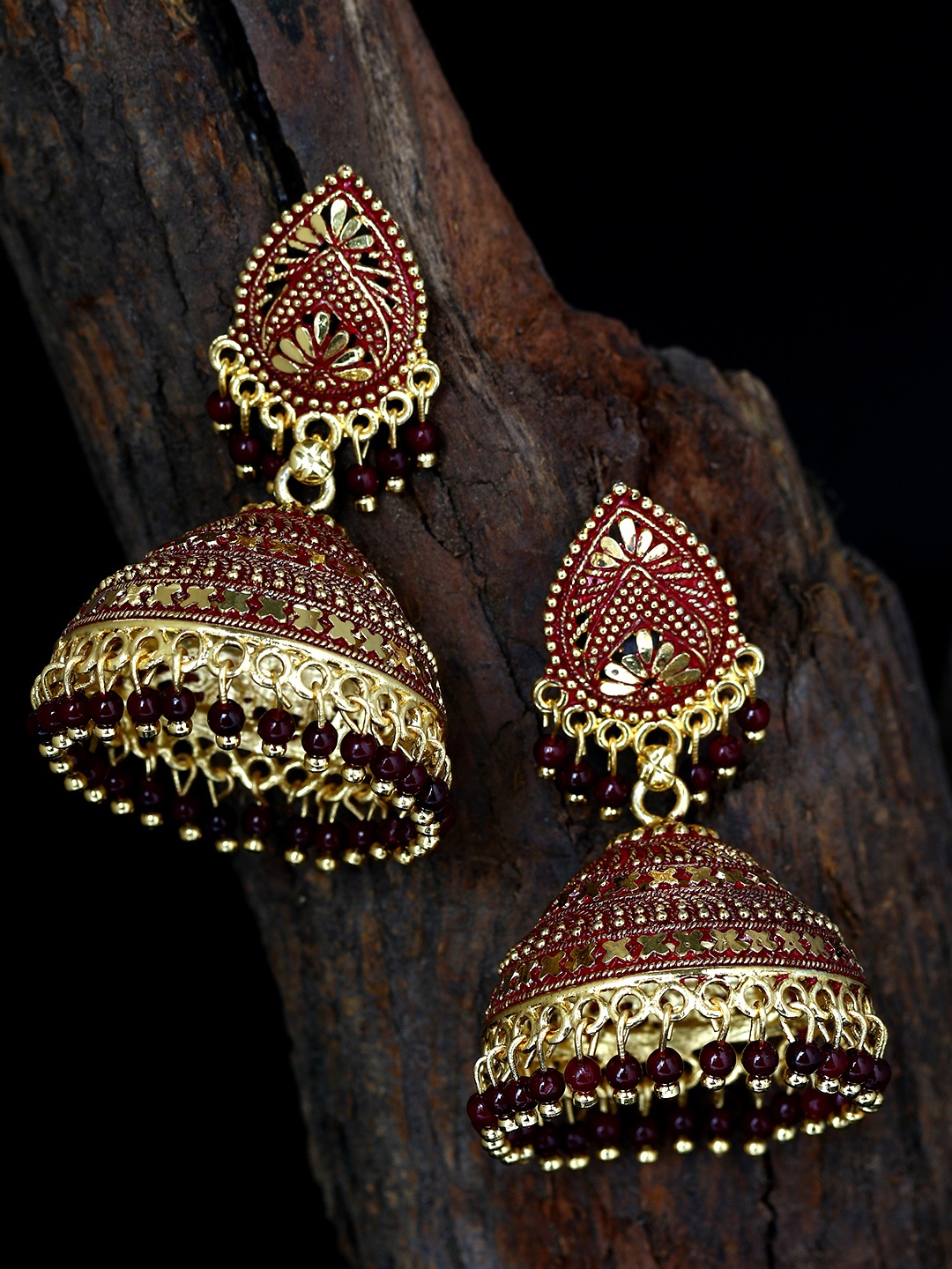
Leather Straps And Skin Harmony
Leather straps offer a softer, more adaptable aesthetic compared to metal. However, colour still matters. Dark brown, tan, black, and even navy straps each interact differently with skin tones.
Warm undertones often glow with earthy shades like tan or dark brown. These colours create a grounded, natural feel. Cool undertones, on the other hand, find balance in black or deep blue straps, which add a refined contrast.
Imagine a weekend outing in a simple shirt and jeans. A well-chosen leather strap quietly completes the look without demanding attention. But a mismatched one can feel distracting, even if no one explicitly points it out.
Leather also ages over time, developing character. When the colour suits the skin, this ageing process enhances the watch's appeal rather than diminishing it. It becomes part of a personal story rather than just an accessory.

Buying A Watch? Here's How To Match It Perfectly With Your Skin Tone; Photo Credit: Pexels
Dial Colours That Complement Rather Than Clash
The dial is often the first thing people notice. Yet, many choose dial colours based on trends rather than compatibility. Bright blues, greens, or blacks may look striking in isolation but can behave differently on the wrist.
Warm undertones often pair well with cream, champagne, olive, or brown dials. These colours create a seamless, cohesive appearance. Cool undertones tend to shine with black, navy, white, or grey dials, offering crisp contrast.
Picture a formal meeting where subtlety matters. A dial that complements skin tone enhances presence without appearing flashy. It communicates attention to detail in a quiet, confident way.
Dial colour also influences how easily a watch transitions across occasions. A well-matched dial feels appropriate everywhere, from office settings to evening gatherings. That versatility adds real value beyond the price tag.
The Role Of Watch Size And Proportion
While colour dominates the conversation, size quietly shapes the overall effect. A watch that is too large or too small can disrupt balance, regardless of how well the colours match.
Skin tone interacts with size in subtle ways. Darker tones often carry larger dials with ease, while lighter tones may benefit from moderate sizes that don't overwhelm the wrist. However, wrist size remains the primary factor.
Consider someone spending ₹15,000 on a bold, oversized watch because it looks impressive in the store. Once worn daily, it feels bulky and impractical. The excitement fades quickly.
Proportion ensures comfort and visual harmony. A well-sized watch feels like an extension of the wearer rather than an accessory trying too hard. It's the difference between effortless style and forced fashion.
Mixing Metals Without Making A Mess
Many hesitate to mix metals, fearing it may look chaotic. However, when done thoughtfully, mixing metals can create a modern, dynamic look.
The key lies in balance. A watch with both silver and gold elements can work across different outfits and accessories. It also suits neutral undertones particularly well, offering flexibility.
Imagine pairing a mixed-metal watch with everyday jewellery. It eliminates the need to match everything perfectly, making styling easier. But if the tones clash too strongly with skin, the result feels disjointed.
This approach suits those who prefer versatility over strict coordination. It reduces the need for multiple watches and allows one piece to adapt across situations. When chosen correctly, it feels intentional rather than accidental.

Buying A Watch? Here's How To Match It Perfectly With Your Skin Tone; Photo Credit: Pexels
Occasion Matters More Than Trends
Trends come and go, but occasions remain constant. A flashy watch may feel exciting, but it doesn't always fit everyday settings. Matching a watch to both skin tone and occasion ensures it remains relevant.
For formal settings, subtle tones that complement skin create a polished look. Casual outings allow more experimentation, but harmony still matters. A neon dial might attract attention, but it rarely blends well with most skin tones.
Consider weddings, office meetings, or weekend brunches. Each setting calls for a different mood. A well-matched watch adapts without appearing out of place.
Choosing based on occasion also prevents impulsive purchases driven by trends. It encourages thoughtful decisions that stand the test of time, both stylistically and practically.
Budget Doesn't Guarantee Style
A common misconception suggests that a higher price equals a better style. Yet, even a ₹40,000 watch can look underwhelming if it clashes with skin tone. Meanwhile, a ₹3,000 watch that matches perfectly can appear far more elegant.
Style depends on harmony, not cost. Understanding personal undertones allows smarter spending. It prevents unnecessary upgrades in search of a “better” watch when the issue lies elsewhere.
Many people upgrade repeatedly, hoping to find the perfect piece. The cycle continues until they realise the missing factor isn't brand or price, it's compatibility.
Investing time in understanding what suits the skin saves money in the long run. It turns each purchase into a confident decision rather than a gamble.
Seasonal Choices And Skin Interaction
Skin tone can appear slightly different under varying lighting and seasons. Sun exposure, for instance, may deepen tone temporarily, affecting how certain colours look.
Warm metals often glow beautifully in sunlight, making them ideal for outdoor seasons. Cooler tones may shine more in indoor or evening settings, where artificial lighting enhances their appeal.
Think of summer holidays versus winter evenings. The same watch can feel different depending on the environment. Choosing versatile tones ensures consistency across seasons.
Seasonal awareness doesn't require multiple watches. It simply involves choosing colours that remain flattering under different conditions. This approach keeps style consistent without overcomplicating choices.
Confidence Is The Final Touch
No guide matters if the wearer feels uncomfortable. Confidence transforms how a watch is perceived. When a piece aligns with skin tone, it naturally boosts that confidence.
A well-matched watch doesn't demand attention; it earns it quietly. It becomes part of the wearer's identity rather than a separate element. People notice it without quite knowing why it looks right.
On the other hand, a mismatched watch often leads to subtle discomfort. It may go unworn or feel like an afterthought. That disconnect affects overall presence more than expected.
Choosing the right watch isn't just about aesthetics. It's about feeling at ease, knowing that every detail works in harmony. That assurance reflects in posture, gestures, and overall style.
Products Related To This Article
1. Fastrack Stunners Quartz Analog With Black Dial Watch For Guys
2. Titan Raga Viva Quartz Analog With Rose Gold Dial Watch For Women
3. GUESS Round 46mm Blue Dial Analog Men Watch
4. GIORDANO Women Embellished Dial & Leather Straps Analogue Watch
5. CASIO Men Dial & Stainless Steel Cuff Straps Analogue Watch
A watch may seem like a small detail, but it carries a surprising influence. It frames the wrist, watches complement outfits, and quietly communicates taste. Yet, without considering skin tone, even the most expensive choice can fall flat.
The solution doesn't involve chasing trends or spending more. It begins with understanding undertones, observing how colours interact with skin, and choosing pieces that feel naturally aligned. Small adjustments, metal shade, strap colour, dial choice, create a noticeable difference.
Over time, these choices build a collection that feels personal and effortless. Each watch becomes more than an accessory; it becomes a reflection of thoughtful style.
Next time a watch catches the eye, pause for a moment. Not to question the design or price, but to ask a simpler question: Does it truly belong on that wrist?
(Disclaimer: This article may include references to or features of products and services made available through affiliate marketing campaigns. NDTV Convergence Limited (“NDTV”) strives to maintain editorial independence while participating in such campaigns. NDTV does not assume responsibility for the performance or claims of any featured products or services.)