How Overdecorating Walls Can Make Even Big Homes Feel Small
Too much wall décor can make even well-sized homes feel cramped. From visual clutter to blocked light, overdecorated walls quietly shrink spaces. Learn why less on your walls often makes rooms feel larger and how you can decorate and still balance your wall decor.

Too Much Wall Decor? How Visual Clutter Can Make Your Home Feel Noticeably Smaller And Confined.
Walls do more than hold up roofs. They frame daily life, host memories, and quietly shape how a home feels. In many homes, walls turn into galleries of framed photos, mirrors, metal art, shelves, clocks, decals, and the odd souvenir from a holiday. Each piece carries meaning. Together, they can overwhelm. Smaller flats and compact houses already face space challenges. Add too much wall décor, and rooms begin to feel boxed in. Light bounces less, eyes dart without rest, and the sense of openness fades. What starts as decoration ends as a distraction.

Discover expert tips to prevent walls from looking overdecorated; Photo Credit: Unsplash
Homes should feel lived-in and warm. The aim lies in balance. Understanding how walls influence perception helps create rooms that feel larger, calmer, and more welcoming. The reasons below unpack how excess wall decor shrinks space and how thoughtful choices restore it.
Also Read: Wall Art Decor Under ₹1,000: Want To Know How To Fake An Expensive Look In Your Home?
How Wall Décor Quietly Changes The Way A Home Feels
1. Visual Clutter Confuses the Eye
The human eye craves order. When walls host too many elements, the eye jumps from one object to another without pause. This constant movement creates mental clutter. Rooms feel busy, even if floor space remains unchanged.
Think of a living room wall filled with photo frames in different sizes, a clock, a hanging plant, and a bold artwork squeezed between. Each item fights for attention. Instead of one clear focal point, there are many competing ones. The brain struggles to process them together.
This confusion shortens perceived distance. Walls seem closer because the eye never gets a clear line of sight. Open wall space works like visual breathing room. It allows the eye to rest and register depth.
A single large artwork or a well-spaced gallery with uniform frames often looks calmer than dozens of unrelated pieces. Less chaos leads to more perceived space. Calm walls quietly stretch a room, without moving a single brick.
2. Walls Lose Their Role as Backgrounds
Walls work best when they act as supportive backgrounds. They highlight furniture, textures, and people. Over-decorating turns walls into performers instead of supporters.
When every inch demands attention, furniture loses prominence. Sofas, tables, and even windows fade into the background. The room feels flatter because there is no hierarchy. Everything shouts at once.
Consider a bedroom where the wall behind the bed carries layered art, hanging lights, decals, and shelves. Instead of feeling cosy, the space presses inward. The bed no longer anchors the room. The wall dominates.
Keeping walls simpler restores balance. Furniture regains its role. Rooms feel layered again, with clear foregrounds and backgrounds. This depth makes spaces feel larger and more intentional. Walls step back, and the room steps forward.
3. Overcrowded Walls Reduce Light Flow
Light makes spaces feel open. Natural light especially needs clear paths to bounce and spread. Heavy wall décor interrupts this movement.
Dark frames, bulky shelves, and dense art clusters absorb light. They create visual weight. Even mirrors lose effectiveness when surrounded by clutter, as reflections get fragmented.
In homes where daylight already feels precious, this matters. A room with limited windows relies on walls to reflect light. When walls wear too much décor, they trap light instead.
Lighter walls with fewer obstructions reflect brightness better. A single mirror placed thoughtfully does more than three squeezed together. Light travels freely, corners soften, and the room feels airier.
The result feels subtle yet powerful. Walls stop acting like barriers and start acting like amplifiers. Space expands through brightness alone.
4. Small Rooms Suffer the Most
Large homes may tolerate heavier décor. Smaller rooms cannot. What looks charming in a spacious bungalow can overwhelm a compact flat.
In small bedrooms, kitchens, or corridors, every wall matters. Filling them with art, hooks, racks, and hangings reduces already limited visual space. Ceilings appear lower. Walls feel closer.
A narrow passage lined with frames on both sides often feels tighter than it is. A small study with shelves stacked high feels boxed in, even when storage helps.
Choosing restraint becomes essential in compact areas. One accent wall works better than four decorated ones. Vertical space needs care. Too many items at eye level compress space.
Small rooms reward simplicity. Clear walls stretch boundaries. Thoughtful décor adds character without stealing space.
5. Emotional Overload Shrinks Comfort
Space is not only physical. It is emotional too. Walls crowded with objects can feel emotionally heavy.
Every framed memory, quote, or artefact carries a story. Too many stories at once overwhelm. The room stops feeling restful. Comfort slips away.
Living rooms should invite conversation. Bedrooms should soothe. Study areas should focus. When walls bombard senses, these goals suffer.
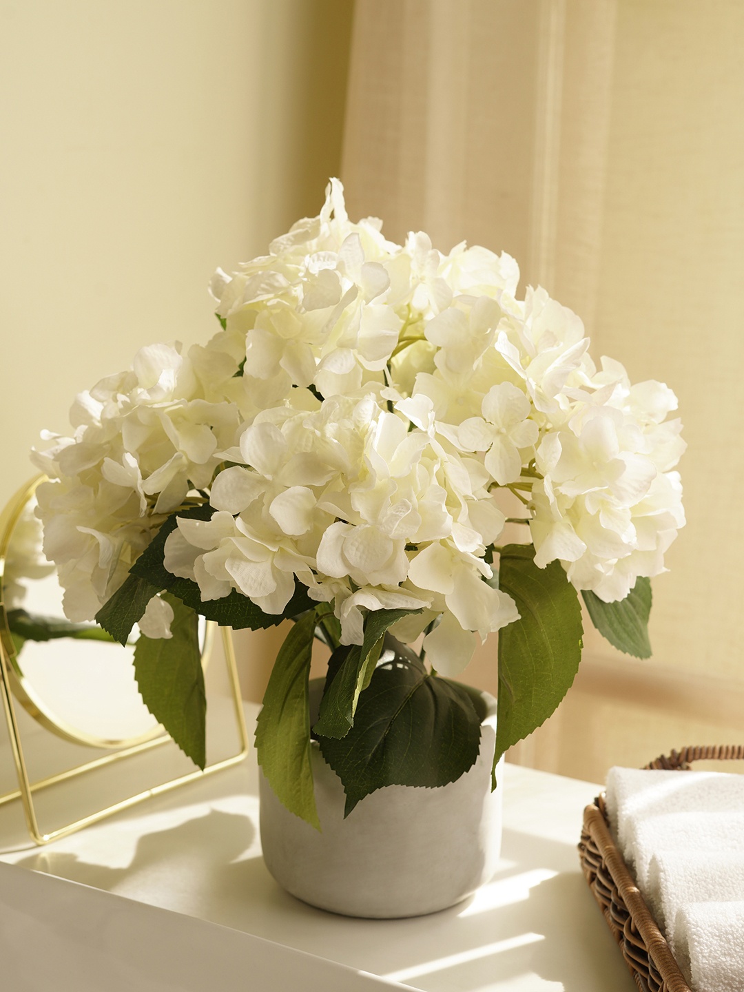
A wall full of family photos may feel warm at first. Over time, the sheer number can feel noisy. Choosing fewer, meaningful images often creates a deeper emotional impact.
Calm walls support calm minds. When eyes relax, bodies follow. Rooms feel larger because they feel lighter emotionally. Space grows through ease, not emptiness.

Always refrain from framing every special moment to prevent cluttering your space; Photo Credit: Unsplash
6. Lack of Focal Points Shrinks Perspective
Good design needs focal points. They guide attention and create structure. Too much wall décor removes this clarity.
When everything tries to be special, nothing stands out. The eye finds no anchor. Perspective flattens.
A bold painting above a sofa draws focus and sets scale. Surround it with smaller items, and its impact fades. The wall becomes a collage instead of a statement.
Clear focal points create depth. They pull the eye forward, then allow it to explore. Without them, rooms feel shorter and narrower.
Choosing one hero piece per wall often works best. Supporting elements can sit quietly elsewhere. This hierarchy restores proportion and makes rooms feel expansive.
7. Mixed Styles Create Visual Noise
Walls often become testing grounds for styles. Traditional art meets modern prints. Rustic hangings sit beside sleek clocks. The mix can charm or confuse.
Too many styles together create visual noise. The room loses coherence. Eyes work harder to make sense of it all.
This noise shrinks space because unity disappears. Cohesive spaces feel larger because they read as one whole. Fragmented styles break that flow.
Choosing a consistent theme helps. Similar frames, colours, or materials tie elements together. Even varied art looks calmer when the presentation aligns.
Harmony stretches space. Chaos compresses it. Walls reflect this truth clearly.
8. Storage Disguised as Décor Adds Bulk
Wall-mounted storage often doubles as décor. Shelves hold books, plants, curios, and boxes. While useful, excess shelving adds bulk.
Each shelf line cuts across the wall, shortening its height visually. Stack many and ceilings drop in perception.
Overloaded shelves also create clutter. Items spill visually into the room. What saves floor space eats wall space instead.
Choosing fewer shelves with curated content works better. Closed storage reduces visual mess. Vertical shelving placed thoughtfully can even enhance height.
Walls need openness as much as utility. Balancing storage and space keeps rooms feeling generous.
9. Colour Overload Magnifies the Problem
Décor often brings colour. Too many colours on the walls intensify crowding.
Bright frames, bold art, and contrasting elements pull walls closer. They demand attention. Neutral walls with restrained colour accents feel farther away.
This does not mean avoiding colour. It means choosing it wisely. A single colourful artwork pops more on a calm wall than among many rivals.
Colour works best when it breathes. Walls crowded with colour shrink rooms faster than those with gentle palettes.
Let colour shine through select pieces. Allow walls to support, not compete.
10. Empty Space Enhances What Remains
Empty space carries power. It highlights what stays.
Walls with space around décor make each piece feel intentional. Art looks more valuable. Rooms feel curated, not cluttered.
This space creates rhythm. Eyes move smoothly. Depth appears. Rooms feel larger without adding anything new.
Leaving parts of the walls bare often feels uncomfortable at first. Over time, it feels freeing. Homes gain clarity.
Empty space does not mean lack. It means confidence. It allows walls to do their quiet work, expanding rooms through simplicity.
Products Related To This Article
1. Wall Decor for Living Room
2. Amazon Brand - Solimo Leaves Metal Wall Decor
3. The Castle Decor Golden Deer Wall Painting for Living Room Big Size
4. DSH CRAFTING YOUR CURIOSITY Metal Wall Decor
5. Dime Store Engineered Wood Floating Shelves for Wall Decor Wall Shelf Storage Organizer
6. Decazone Macrame Indoor Wall Hanging Shelf Chic Decor Wood Floating Boho Shelves
7. Fizzytech Deer Lamp – Modern Decorative Wall Light with Golden Deer Design
Wall decor adds personality, warmth, and story to homes. Yet excess turns charm into crowding. When walls carry too much, rooms shrink visually and emotionally. Homes thrive on balance. Walls that breathe allow life to flow. Space grows not by removing meaning, but by giving it room to shine.
(Disclaimer: This article may include references to or features of products and services made available through affiliate marketing campaigns. NDTV Convergence Limited (“NDTV”) strives to maintain editorial independence while participating in such campaigns. NDTV does not assume responsibility for the performance or claims of any featured products or services.)