Stop Your Tops from Looking Cheap with This Easy Fabric Weight Fix
If your top clings, turns sheer, or loses shape fast, fabric weight is the culprit. This is the easiest fix to make everyday tops look more expensive instantly. Learn how you can make affordable tops look and feel expensive.

How to Make Tops Look Expensive: The Simple Fabric Weight Fix That Works.
There's a very specific heartbreak that happens when a top looks great online, arrives in a neat package, and then behaves like wet tissue paper the moment it meets real life. It wrinkles if someone breathes near it. It sticks to every curve. It turns mysteriously sheer when standing near a window. It also somehow makes even expensive jewellery look slightly suspicious, like it's trying too hard.

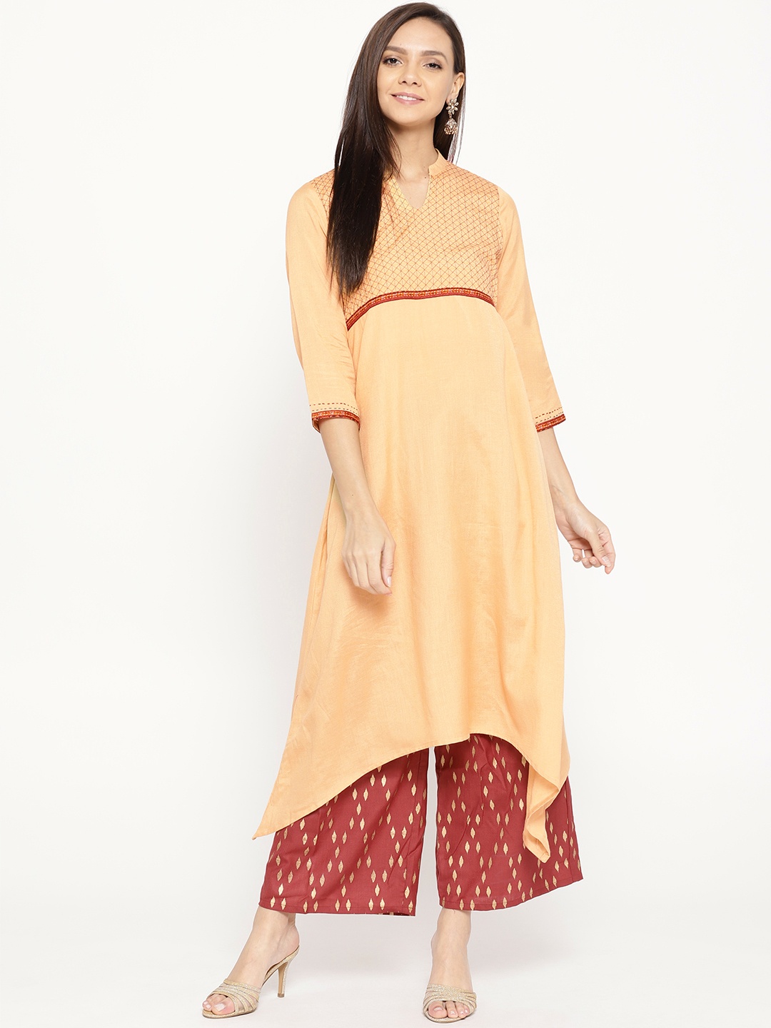
Make your simple tops look expensive with these easy styling tips; Photo Credit: Unsplash
Most people blame tailoring, or assume the brand cut corners. Sometimes that's true. But a lot of the time, the real issue is fabric weight, how thick, dense, and structured the cloth feels and falls.
Fabric weight is the silent difference between “effortless chic” and “why does this look like a free T-shirt from a college fest?” And the best part is, fixing it doesn't require a wardrobe overhaul. It's about learning a few tricks, making smarter fabric choices, and using simple layering and finishing hacks that instantly upgrade how tops look.
Also Read: Everyday Tops That Don't Ride Up: 7 Styles That Stay Put All Day
Before You Shop Again, Fix This One Fabric Problem
1) Learn the fabric weight trick: hold it to the light
The quickest way to tell if a top will look premium is also the simplest: hold it up to the light. If it turns into a shadow puppet theatre, it's going to behave like one in daylight too. Sheerness isn't always a dealbreaker, but unplanned sheerness is what makes tops look flimsy and cheap.
This matters even more in humid weather. Lightweight fabric can cling to the body and highlight every crease from the bra strap to the waistband seam. It also tends to lose shape faster, which is why necklines start sagging and sleeves begin drooping after a few washes.
A good-weight top doesn't have to be thick like winterwear. It just needs enough density to fall smoothly. It should skim, not stick. It should sit, not collapse. If shopping offline, this one test saves money and disappointment. If shopping online, look for close-up fabric photos and reviews that mention “thick”, “not sheer”, “holds shape”, or “structured”.
2) Pick smarter cottons: not all cotton is equal
Cotton has a great reputation, and honestly, it deserves it. But not all cotton is created equal. Some cotton tops feel crisp, hold their structure, and look polished even with minimal effort. Others feel thin, limp, and end up looking tired before lunchtime.
The difference often comes down to the knit or weave. Cotton jersey (common in basic tees) can look casual and fine, but cheaper jersey tends to stretch out and cling. Cotton poplin, on the other hand, looks sharper and more “put together” because it has a firmer structure. Cotton twill also holds shape well and gives a richer look.
For everyday tops, cotton blends can be a lifesaver. A touch of elastane can improve fit without turning the fabric into clingy chaos. A small percentage of polyester in the right blend can add durability and reduce wrinkling. The key is how it feels in the hand. If it feels papery, it will look papery.
3) Stop fighting cling: add a slip layer like a grown-up secret
Cling is the enemy of expensive-looking outfits. A top can be a lovely colour and still look cheap if it sticks to the body in odd places. That sticky cling happens more in summer, during monsoon humidity, and in air-conditioned offices where fabric behaves unpredictably.
A surprisingly effective fix is wearing a lightweight slip layer underneath. Not a thick camisole that adds bulk, but a smooth, close-fitting inner layer that helps the top glide instead of grab. This also prevents visible bra lines and reduces the “fabric tugging” effect around the bust.
The magic is in the texture. Smooth fabric underneath makes the outer top fall better. It's like putting a bedsheet on a mattress properly instead of tossing it and hoping for the best.
This is one of those wardrobe habits that feels unnecessary until it becomes a daily essential. Once it's part of the routine, even simpler tops look more polished, and suddenly the outfit feels intentional instead of accidental.
4) Use the “weight illusion” trick: tuck, half-tuck, or anchor
Sometimes the fabric isn't terrible, it's just too floaty. Light fabric can balloon, crease, and move oddly when walking. It also tends to ride up, especially with high-waist jeans or trousers. That movement reads as cheap because it looks fussy.
The fix is anchoring. A full tuck can add instant structure. A half-tuck can create shape without looking stiff. Even a tiny front tuck can stop a top from flapping around like it's trying to escape.
Anchoring works because it gives fabric a reference point. Without that, lightweight material can hang awkwardly, especially around the midsection. With a tuck, the top gains shape, and the outfit gains balance.
This trick is also brilliant for tops that look too casual. A basic tee can look “nice” with a tuck and a belt. A thin shirt can look more premium when it's tucked neatly, and the sleeves are rolled properly. It's not about hiding flaws. It's about giving the fabric a job, so it stops misbehaving.
5) Upgrade the neckline: the cheapest-looking area is often the collar
If a top looks cheap, the neckline is often to blame. A stretched collar, a flimsy V-neck, or a neckline that sits oddly can ruin the whole vibe. Even expensive fabric won't save a top if the neckline looks tired.
Heavier fabric tends to hold neckline shape better, but there are also design cues that help. A ribbed collar adds structure. A facing inside the neckline (common in better-made blouses) helps it sit flat. A slightly higher neckline often looks more refined than a deep scoop, especially in softer fabrics.
For those who love wide necks, boat necklines look elegant when the fabric has enough weight. But in thin fabric, they collapse and look droopy.
This is where small tailoring fixes can work wonders. If a neckline gapes, a tailor can often add a tiny stitch or dart for a very reasonable amount, sometimes less than ₹150. It's a small spend for a big visual upgrade.

Look for tops made of heavy fabrics that hold the neckline upright and looking professional; Photo Credit: Unsplash
6) Choose prints that hide thinness: patterns can “thicken” fabric visually
A plain, solid-colour top shows every flaw. If the fabric is thin, it will look thin. If it wrinkles, the wrinkles will stand out. If it clings, the cling will be obvious. Prints, textures, and darker shades can camouflage a lot of that.
This doesn't mean hiding behind loud patterns. Even subtle prints, tiny florals, small checks, micro-stripes, can make a fabric look more substantial. Texture helps too. Slub cotton, dobby weaves, and light embroidery add depth and make the fabric look richer.
There's also a psychological trick at play. A plain top reads as “minimal”, which makes people notice quality more. Minimal looks expensive only when the fabric and finishing are excellent. Prints give the eye something else to focus on, so the fabric doesn't get judged as harshly.
This is especially useful for budget buys. If a top costs ₹499, a well-chosen print can make it look far more premium than a plain white tee in thin jersey.
7) Pressing isn't optional: wrinkles scream “cheap” louder than logos
Wrinkles don't always mean poor quality, but they can make a top look neglected. And neglected often reads as cheap. A beautifully cut blouse can look like a mess if it's creased in the wrong places. A crisp cotton shirt can look like it's been slept in if it isn't pressed.
The issue is that many tops today use light fabric that wrinkles quickly. This is common with rayon, thin cotton blends, and certain poly mixes. It's not a moral failure. It's just physics.
A quick steam can change everything. Even hanging a top in the bathroom while a hot shower runs can relax minor wrinkles. For those who hate ironing, a handheld steamer is one of the most practical wardrobe investments, and good ones are available around ₹1,500–₹2,500.
Pressing also improves fabric fall. It smooths out the areas that cling. It sharpens the seams. It makes the neckline sit better. The top suddenly looks like it belongs in a well-lit store display instead of the bottom of a laundry basket.
8) Pay attention to hems and stitching: finishing is where quality hides
Fabric weight matters, but finishing matters almost as much. A top can use decent fabric and still look cheap if the stitching is sloppy, the hem is thin, or the seams twist after washing.
A wider hem often looks more premium because it adds weight at the bottom edge. A narrow, rolled hem can look delicate when done well, but cheap versions often look flimsy. Uneven stitching, loose threads, and puckered seams are all red flags.
This is why some tops feel “off” even when the fabric seems fine. The finishing doesn't support the fabric. It's like building a nice house and then fitting it with a door that doesn't close properly.
When shopping, check the inside seams. If they look clean and tidy, the top is likely to last longer and look better. If they look messy, the top may lose shape quickly. For online shopping, reviews that mention “good stitching” and “neat finishing” are worth trusting.
9) Fix transparency properly: nude layers beat white layers every time
One of the biggest reasons tops look cheap is accidental transparency. The top looks fine indoors, then turns sheer under daylight. This is especially common with white, pastel, and light beige fabrics. It's also common with thin cotton, rayon, and chiffon-style materials.
The fix isn't always buying a thicker top. Sometimes the top is lovely, and it just needs smarter layering.
The most important trick: avoid white innerwear under white tops. White shows through. It creates a bright patch that draws attention. Nude-toned innerwear blends with skin and disappears under fabric. This one change can make even a budget top look instantly more polished.
If the top is extremely sheer, a nude slip camisole works better than a contrasting layer. Contrast can look stylish when done intentionally, but accidental contrast looks messy. The goal is clean lines and smooth coverage. When the fabric looks even and consistent, the whole top looks higher quality.
10) Buy fewer, better-weight basics: the cost-per-wear maths wins
The final fix is the most boring and the most powerful: buy fewer basics, but buy better ones. Basic tops are worn constantly. They face the most washing, the most sweating, and the most styling pressure. If the basics are thin and flimsy, the whole wardrobe feels cheap, no matter what else is in it.
This doesn't mean spending ₹3,000 on every tee. It means being strategic. A good-weight black tee, a structured white shirt, and a solid neutral top can carry outfits for years. These pieces also make cheaper accessories look more expensive, which is a fun bonus.
Better-weight basics also behave better. They don't cling as much. They don't turn see-through. They don't lose shape quickly. They hold necklines and hems properly. They also feel nicer to wear, which matters more than most people admit.
The wardrobe becomes calmer. Less fussing. Less tugging. Less “why does this look weird?” And more outfits that feel effortless.
Products Related To This Article
1. CORSICA Indie Floral Printed Vest
2. DressBerry Maroon Self Design Lace Top With Slip
3. Chemistry Rust Orange & Off White Striped Shirt Style Top
4. all about you Women Beige & Rust Red Floral Printed Top
5. ZEUGEN Puff Sleeve Square Neck Regular Top
6. Roadster The Life Co. Lace Insert Detail Puff Sleeves Pure Cotton Shirt Style Top
7. Burgstudio9 Sweetheart Neck Cotton Crop Regular Top
A top doesn't look cheap because it's affordable. It looks cheap because it behaves like it's struggling. When fabric clings, turns sheer, collapses at the neckline, or wrinkles into chaos, it sends the wrong message, no matter how good the colour or fit is.
Fabric weight is the quiet upgrade most people overlook, yet it changes everything. It's the difference between a top that sits beautifully and one that constantly needs adjusting. The fix isn't complicated. It's a mix of smarter fabric choices, simple layering, better finishing awareness, and a few styling anchors that make lightweight tops look more structured.
The best part is that these changes don't demand a new wardrobe. They just demand better habits. And once those habits kick in, even everyday tops start looking like they cost more than they did, without anyone needing to know the secret.
(Disclaimer: This article may include references to or features of products and services made available through affiliate marketing campaigns. NDTV Convergence Limited (“NDTV”) strives to maintain editorial independence while participating in such campaigns. NDTV does not assume responsibility for the performance or claims of any featured products or services.)