Why Printed T-Shirts Look Cheap: 10 Common Design And Print Mistakes
Some printed tees look cheap even when the design is cool. The reason isn’t the idea, it’s the fabric, print finish, colour choices, placement and poor detailing that ruin the final look.

Why Some Printed Tees Look Cheap And Tacky, Even When The Design Idea Seems Cool.
Printed t-shirts are supposed to be easy. You pick a cool graphic, slap it on a tee, and boom, instant style. Yet somehow, plenty of printed tees manage to look like they were made in a hurry during a power cut.
And the frustrating part? The design idea is often genuinely good. The concept is strong. The artwork looks great on a screen. Then it lands on fabric, and suddenly it feels… off. Too shiny. Too stiff. Too loud. Too fake. Like the tee is trying too hard to be cool.
That “cheap and tacky” vibe isn't about taste. It's usually about execution. A tee can be bold without looking messy. It can be playful without looking like a children's birthday banner. But it needs the right ingredients.
Let's break down the biggest reasons printed tees flop, especially when the idea had potential.

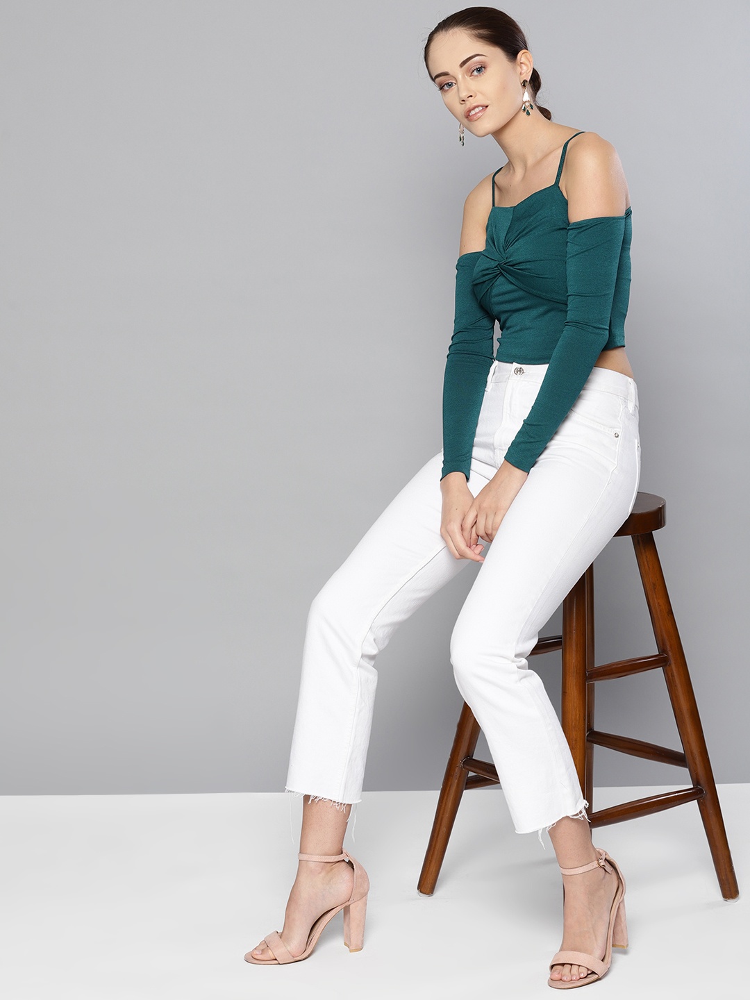
Why Some Printed Tees Look Cheap And Tacky, Even When The Design Idea Seems Cool
Photo Credit: Pexels
The Real Reasons Some Printed Tees Miss The Mark
1) The Fabric Looks Weak Before The Print Even Starts
A great print cannot rescue a flimsy tee. If the base fabric looks thin, see-through, or rough, the final piece will always feel budget, no matter how trendy the design is.
Many tees in the ₹299–₹499 range cut corners on the fabric. They use low GSM cotton, mixed fibres that pill quickly, or yarn that looks fuzzy after one wash. Then the print sits on top like a sticker on a dusty window.
The worst part? Even expensive prints look odd on bad fabric. A detailed illustration can lose sharpness because the surface isn't smooth. A bold logo can warp because the knit stretches unevenly. A dark print can look patchy because the fabric absorbs ink inconsistently.
A tee should look good even before the graphic arrives. If the plain version looks like something worn under a school uniform, the print won't magically turn it into streetwear.
2) The Print Finish Is Too Shiny Or Too Rubber-Like
That glossy, plastic finish is one of the fastest ways to make a tee look cheap. Many people don't realise it's not the design that feels tacky, it's the print texture.
A shiny print reflects light in a way that screams “mass-produced”. It also makes the tee look stiff, like the fabric and the design are fighting each other. Even worse, that rubbery layer can crack after a few washes, especially in humid weather and harsh sunlight.
The design could be brilliant. A clean typographic quote, a retro graphic, even a minimalist logo. But if it feels like a vinyl sticker pressed onto the chest, it instantly loses credibility.
A quality print should feel integrated, not pasted. It should breathe with the fabric. The moment the print starts behaving like a plastic badge, the tee stops looking like clothing and starts looking like merchandise.
3) The Colours Look Loud In A Bad Way
Colour is tricky. On a screen, everything looks vibrant and balanced. On fabric, colour behaves differently. And that's where many printed tees fall apart.
Some tees use neon shades or oversaturated inks that look harsh under daylight. Others use colours that clash with the base fabric. A bright red print on a warm beige tee can look accidental rather than intentional. A pastel design on a bright white tee can look faded instead of soft.
Then there's the classic problem: blacks that aren't truly black. Many prints end up looking greyish or brownish, especially after a couple of washes. That makes the entire design feel old and tired very quickly.
Good colour choices feel controlled. Even loud tees need discipline. Otherwise, the tee starts looking like a poster someone wore by mistake.
4) The Design Has Too Many Elements Fighting For Attention
Sometimes the idea is cool, but the design tries to do everything at once. A quote, a logo, a character illustration, a background texture, random stars, random scribbles, and maybe a “1997” for no reason. Suddenly, the tee looks like a cluttered WhatsApp status.
Too much visual noise is a common reason tees look tacky. Not because maximalism is wrong, but because bad maximalism looks like panic. It feels like the designer didn't trust any one element to carry the idea, so they kept adding.
A tee is not a billboard. It's also not an A3 poster. People view it in motion, in real life, from different angles. The best designs have a clear focal point. Even if the design is complex, it should still feel organised.
When everything screams, nothing feels stylish. The tee ends up looking like a bargain-bin souvenir from a tourist shop.
5) The Placement Feels Random Or Too High
Placement is one of those small details that changes everything. A print can look premium or cheap purely based on where it sits.
Many tees place the graphic too high, almost choking the neck area. This makes the tee look like a uniform. Others place it too low, so it disappears under an open shirt or sits awkwardly on the stomach.
Then there's the common “centre chest, perfectly square” approach. It's safe, but it often feels generic. It gives “default print setting” energy. Like the design was dragged into a template and printed without thought.
Better tees consider body shape and movement. A slightly lowered chest print can feel more modern. A left-chest mark with a bigger back graphic can feel more street. A sleeve print can feel sporty. But random placement, especially without balance, makes even good artwork look cheap.
6) The Print Cracks, Peels, Or Fades Too Quickly
Nothing kills a tee faster than a print that ages badly. Even if the tee looked great on day one, cracking or peeling after three washes turns it into a “home-only” t-shirt.
This usually happens when the wrong print technique is used for the design. Or when the curing process is rushed. Or when cheap ink gets used. Many mass-market tees rely on shortcuts because the focus stays on quick output, not longevity.
Fading can also happen when the ink sits too lightly on the fabric. The design starts looking washed out, even if it was meant to be bold. Cracking happens when the print layer is too thick and stiff. It doesn't stretch with the fabric, so it breaks.
People can forgive a tee shrinking slightly. They don't forgive a graphic that looks like it survived a small war. A premium tee ages gracefully. A tacky one falls apart dramatically.
7) The Typography Looks Like A Last-Minute Decision
Typography can make a tee look sharp and modern, or like a free event t-shirt from 2012.
Many printed tees use fonts that feel dated, overused, or poorly spaced. Sometimes the quote is genuinely funny or meaningful, but the font choice makes it look like a motivational poster. Other times, the letters look stretched, too thin, or too thick, which makes the print look cheap even if the ink quality is decent.
Spacing matters a lot. Kerning that feels off makes the design look amateur. Lines that aren't aligned properly make it look unpolished. A print that curves awkwardly around the chest can look like it was done in a hurry.
The best typography tees look simple, but they rarely are. The font choice, spacing, and weight need to feel intentional. When they don't, the tee ends up looking like someone typed a quote in a hurry and pressed “print”.
8) The Graphic Style Doesn't Match The Tee's Vibe
This is a subtle one, but it matters. A graphic might be cool on its own, but it has to match the mood of the garment.
For example, a delicate, vintage-style illustration on a stiff, thick, oversized tee can feel mismatched. A bold street-style graphic on a slim-fit tee can feel awkward. A playful cartoon on a muted, minimalist tee can look like it wandered onto the wrong outfit.
A tee has its own personality. Fabric, fit, neckline shape, and even the stitch quality all contribute. If the print ignores that personality, the final result feels disconnected.
This is why some designs look better on hoodies than on tees. Or better on washed-out fabric than on bright white. Or better on oversized fits than on fitted ones.
When the print and the tee vibe align, the design feels natural. When they clash, it feels like two different products forced into one.
9) The Brand Tries Too Hard To Look “Trendy”
Trends are tempting. A few months of hype can convince brands that every tee needs graffiti text, random flames, fake “college” lettering, or ironic slogans.
But trend-chasing has a downside. It often leads to designs that feel generic. They look like copies of copies. And when the design lacks originality, every flaw becomes more visible.
A tee can be trendy and still feel tasteful. But it needs restraint. It needs a point of view. Otherwise, it starts looking like something created by scrolling for five minutes and borrowing whatever looked popular.
This is also where tackiness sneaks in: too many references, too many borrowed aesthetics, too much “look at me”. It's like wearing five accessories at once. Even if each piece is cool, the overall effect becomes messy.
A good printed tee doesn't beg for attention. It earns it.
10) The Finishing Details Don't Support The Print
People focus on the graphic, but the finishing details decide whether the tee looks premium.
A cheap ribbed neckline that twists after washing makes the whole tee look tired. Uneven stitching makes the garment feel like it came from a factory reject pile. A poor fit, too tight in the shoulders, too long in the torso, and awkward sleeve length, make the print sit badly on the body.
Even labels matter. A scratchy neck tag, messy inside seams, or a badly placed size print can ruin the experience. And once the tee feels cheap to wear, it starts looking cheap, too.
A printed tee is a full product, not just a graphic. When the garment quality doesn't match the confidence of the design, the tee feels like it's pretending.
A truly good printed tee feels cohesive. Everything supports everything. That's when even a simple design looks expensive.

How To Tell If A Printed T-Shirt Is Low Quality: Fabric, Print And Fit
Photo Credit: Pexels
Products Related To This Article
1. Roadster The Lifestyle Co. Typography Printed Drop-Shoulder Sleeves Oversized T-shirt
2.NOBERO Graphic Printed Drop Shoulder Sleeves Cotton Oversized T-Shirt
3. Leotude Women Typography Printed Round Neck Cotton Oversized T-shirt
4. Kook N Keech Garfield Humor & Comic Printed Pure Cotton Regular Fit T-shirt
5. Glitchez Graphic Printed T-shirt
6. TOXA Men Typography Printed T-shirt
7. HRX by Hrithik Roshan Women Printed Printed Training T-shirt
A printed tee doesn't look cheap because it has a bold idea. It looks cheap when the execution feels careless.
Most tacky tees share the same problems: weak fabric, shiny prints, chaotic layouts, poor placement, loud colours, and finishing that doesn't hold up. The sad part is that many of these issues are avoidable. They just require more thought, better production choices, and a little respect for the garment.
A great printed tee should feel effortless. It should look good in a mirror, in sunlight, in photos, and after ten washes. It should feel like something chosen, not something received for free.
The next time a tee looks oddly “off” despite a cool concept, it's probably not the idea. It's the details quietly sabotaging it.
(Disclaimer: This article may include references to or features of products and services made available through affiliate marketing campaigns. NDTV Convergence Limited (“NDTV”) strives to maintain editorial independence while participating in such campaigns. NDTV does not assume responsibility for the performance or claims of any featured products or services.)